My favorite reading board did not start as a board. It started as a kid named Theo asking me, in October, why the letters on the wall were up so high that only the grown-ups could see them. He had a point. He could not reach the W. So I took the whole thing down on a Friday and rehung it that night with the bottom row at his eye level, which is to say my knees.
Kindergarten reading walls are their own animal. The kids cannot read most of what you post yet, so the wall is half decoration, half promise. Big friendly letters. A book they can recognize by the picture. A little line about reading that the grown-ups smile at while the five-year-olds sound out the first word. I print mine flat on cardstock, laminate the ones that get touched, and tape the rest because staples plus tiny fingers is a bad combination.
Most of these I grabbed as digital files from an indie design shop and ran through the workroom copier the week before our reading corner reveal. A couple are affiliate finds, so if you click through I might get a few cents toward more laminating pouches, which I burn through like nobody’s business. These are the reading bulletin board ideas for kindergarten that survived a full year of small hands.
A quick note, teacher to teacher: some links below are affiliate links. If you grab a file I may earn a little, at no extra cost to you.
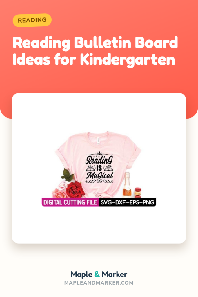
The “Reading Is Magical” sign that started our corner
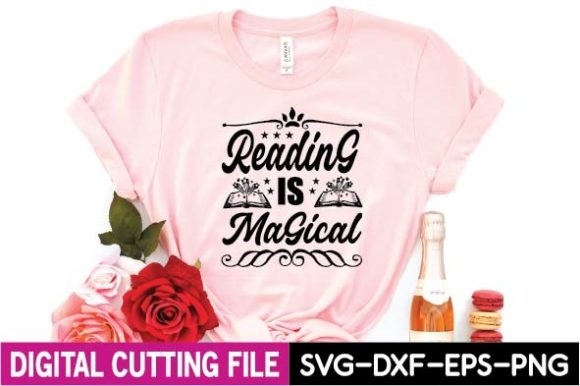
This was the centerpiece over our beanbag the year I went all-in on a cozy reading nook. I printed it on the 11×17 the copier pretends it cannot do, taped two pieces together, and the seam basically vanished once it was up. The lettering is soft and a little whimsical, which reads well to a five-year-old who is mostly looking at the shapes.
Lamination is non-negotiable here. We put it low, right where the kids flop down, and within a week it had a juice handprint on it. Wiped right off the laminate. The paper version would have been done.
One nitpick. The word “magical” has a swoopy tail on the L that I love but that got cut off when I sized it wrong the first time. Check your margins before you commit a sheet of cardstock. I learned the hard way, twice.
“Book Nerd” tucked above the chapter book bin
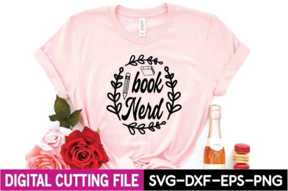
This one is honestly more for me than the kids, but it earns its spot. I printed it small, about half a page, and stuck it on the bin where I keep the picture books that are a little harder, the ones I read aloud and then leave out for the brave ones to flip through.
The design is clean and bold, so it shrinks down without turning to mush. I laminated it and hot-glued it to the front of a plastic crate. Held all year.
The nitpick is small. It is very black-and-white, which is great for ink but a little stark next to all the rainbow kindergarten stuff. I ended up taping a strip of colored border around it so it did not look so serious. Took two minutes, fixed it.
A “Reading Is My Therapy” print for the grown-up corner
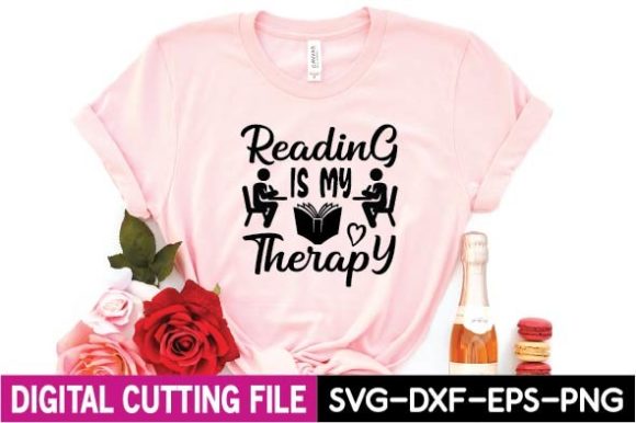
Real talk, this went on my own little teacher shelf by the door, not in the kid zone. Parents waiting for pickup read it and laugh. It sets a tone before anybody even walks in.
I printed it on white cardstock, slid it into a dollar frame, and called it done. No lamination needed since nobody five years old is touching my desk shelf.
If I am picking at it, the phrasing is a touch adult for a kindergarten room, so I would not put it where the kids gather. Keep it grown-up-facing. As a quiet little wink near the sign-in sheet, it works perfectly.
“I Read Past My Bedtime” for the take-home reading nudge
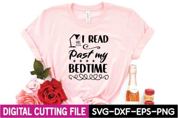
I printed this one tiny and stuck it on the front of our home-reading folders. The idea being, the kids cannot read it but their parents can, and it is a soft little push toward five minutes of books before lights out.
It sized down to a business-card-ish badge really cleanly. I ran a whole sheet, cut them apart with the paper cutter, and glued one to each folder during my prep on a Sunday I should have spent doing literally anything else.
The nitpick is the cutting. The design sits close to the edge, so my slightly-crooked guillotine cuts shaved a letter on a couple of them. Leave yourself a white margin if you are batch-cutting. I did not, and three folders said “I Read Past My Bedtim.”
“Books Because Reality Is Boring” by the cozy chair
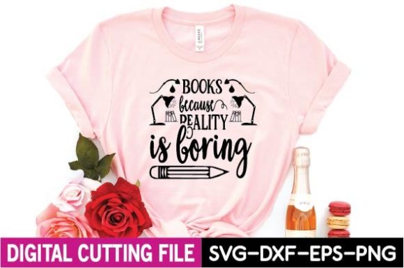
This hung next to our one good reading chair, the squishy one the kids fight over. It is a fun, slightly cheeky line that goes over the heads of the five-year-olds and right into the hearts of their parents at conferences.
I printed it medium, laminated it, and clipped it to the chair with a binder clip so I could swap it when the seasonal stuff went up. Low commitment, easy to move.
My one gripe is that “reality” is a long word and the layout runs a little wide, so on a portrait sheet it felt cramped. I printed it landscape on the next try and it breathed much better. Go wide if your copier lets you.
“Big Books” sign over the oversized read-aloud basket
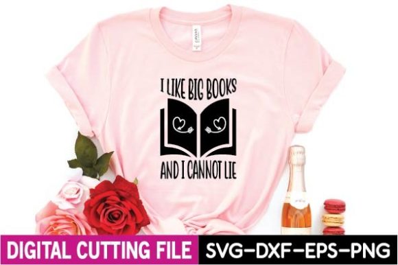
We have a basket of those giant floor books, the ones bigger than the kids, and this sign basically labels itself for that spot. The play on the phrase makes the grown-ups grin and the kids just see a big happy sign over the big happy books.
I printed it on the 11×17, laminated it, and zip-tied it to the basket handle so it stands up above the rim. It has flopped over exactly never.
The nitpick is the font weight. It is chunky, which I like, but the chunkiness means it drinks ink. My first copy came out streaky because the toner was low. Print it when the machine is fresh or your big bold letters come out gray and sad.
“Reading Is My Jam” for the listening center

I stuck this above our listening station, the corner with the headphones where kids follow along to an audio book. It is upbeat and a little silly, which matches the vibe of that spot, half work, half treat.
It printed great at half-page and the colors held up bright on plain cardstock. I laminated it because the headphone corner is where snacks mysteriously end up despite a strict no-snacks rule.
Honest nitpick. The word “jam” leans into a music pun that some of my five-year-olds took very literally and asked where the actual jam was. Not a design flaw, just be ready for the question. Worth it for how cheerful it makes the corner.
Handprint A-Z tracing that doubled as our alphabet border
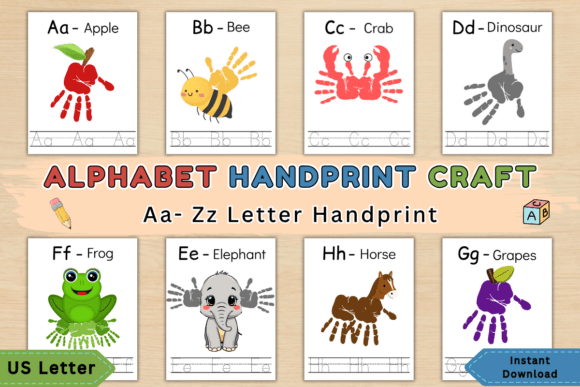
This is the one that actually does double duty in a kindergarten reading wall. It is a full alphabet built around handprint tracing, so I ran it two ways. First as a quiet morning-work activity, then I laminated the finished best ones and they became our alphabet border around the reading corner.
A whole sheet per letter on regular copy paper for the tracing, since we go through a lot. The display copies I bumped up to cardstock so they held a crease when I bent them around the corner of the wall.
The nitpick is the file is print-heavy if you want every kid to have every letter. That is a lot of pages. I ended up assigning each kid a few letters instead of all twenty-six, which honestly worked better anyway. Smaller stack, prouder kids.
The “Y Is for Yak” card nobody else’s alphabet has
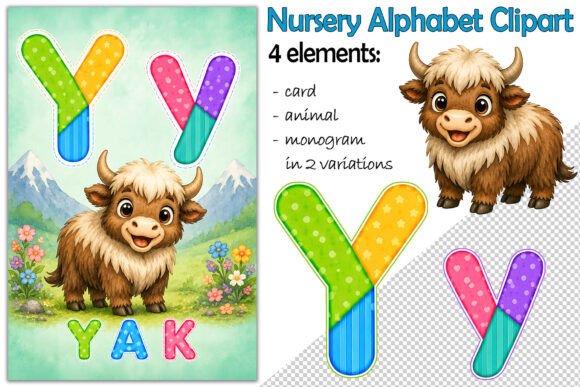
Y is the letter that always gets stuck with yarn or yo-yo, so a yak felt like a tiny win. I printed this as a card for our letter-of-the-week pocket chart and the kids genuinely lost it over the word yak.
The clipart is clean with a transparent background, so it dropped onto my colored card template without a white box ruining it. Printed sharp at small size. I laminated the one card since it gets handled during circle.
Nitpick, it is a single letter, so to do the full alphabet this way you are buying or finding the matching set. As a standalone Y though, it is the cutest one in my whole stack and worth the hunt.
A-to-Z craft pack for our “we built this wall” border
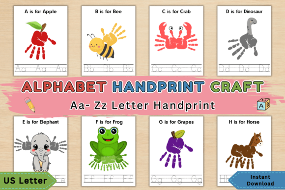
When I want the reading corner to feel like the kids made it, this is the pack I reach for. Twenty-six handprint craft pages, one per letter, and the finished art becomes the alphabet strip running under the reading sign.
We did a few letters a week, painted palms and all, dried them on the drying rack that is always full, and I laminated the keepers. Hung them in order, which took some sorting because someone always paints the M upside down.
The nitpick is the same as any craft-heavy file. It is messy and it is slow. Budget more time than you think, keep wipes close, and accept that a couple letters will be abstract art. The wall looks like them, which is the whole point.
Soft watercolor sage alphabet for the calm corner
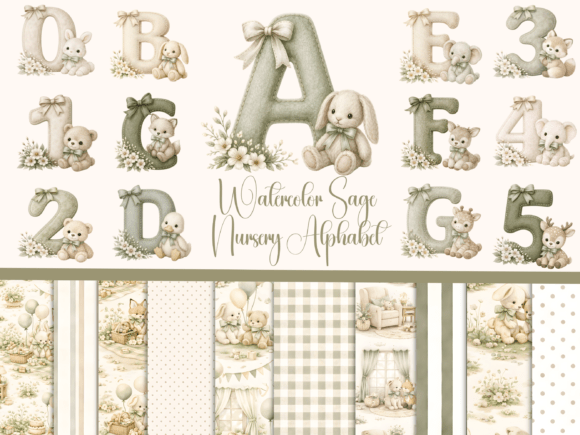
Not every kindergarten reading wall is primary-color chaos. The year I leaned calm and neutral, this sage watercolor alphabet was the backbone of it. Muted greens, gentle letters, the kind of wall that lowers the volume in the room a little.
I printed the set on matte cardstock so the watercolor did not go shiny, then laminated with the matte pouches because glossy would have killed the soft look. Strung them across the top of the reading nook with twine and tiny clips.
The nitpick is real though. Sage on a five-year-old’s wall is pretty for me but low-contrast for them. Little kids learning letters do better with bold. I kept this as the pretty backdrop and added a high-contrast set down low where they actually trace. Best of both, but do not skip the bold version.
“Z Is for Zebra” to close out the alphabet line
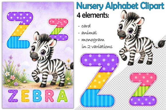
Z is the grand finale of every alphabet wall and a baby zebra is a strong way to end it. I used this card as the last piece in our letter strip and the stripes gave us a whole extra coloring-and-counting tangent.
Clean clipart, transparent background, printed crisp small. I dropped it on the same card template as my other letters so the strip looked like a matched set even though I pulled the animals from a few places.
Nitpick is consistency. Because it is a single-letter file, the art style might not perfectly match your A through Y if you mix sources. I checked that the line weight was close to my others before committing. Close enough that no kindergartner has ever filed a complaint.
The “X Is for Xerus” card that taught me a new word too
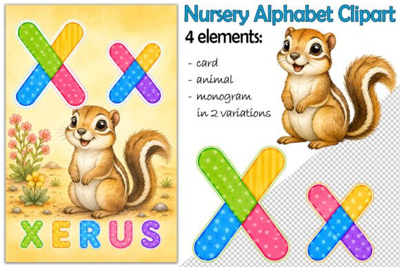
X is the cruelest letter for alphabet walls. Xylophone and x-ray, forever. A xerus, which is a kind of African ground squirrel, was new to me and the kids thought it was hilarious that I did not know it either.
The clipart is sweet and clean, transparent background, prints sharp at pocket-chart size. I laminated it because the X card, being the weird one, gets picked up and examined constantly during circle.
Nitpick, you will be explaining what a xerus is to every single child and a few parents. Keep a one-line answer ready. But honestly, learning a real animal beats another x-ray, and it made our X corner the one kids actually remembered.
“W Is for Whale” right where Theo could reach it
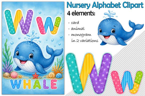
Remember Theo and the too-high W? This is the card I put at his eye level when I rehung the whole alphabet that Friday night. A friendly little whale, big and blue and impossible to miss from the floor.
The art is clean with a transparent background so it sat nicely on my blue card stock without a white box around it. Printed crisp small, and I laminated it since the bottom-row cards are the ones little hands actually reach and peel at.
The nitpick is minor. Whale is one of those words where the W sound and the letter do not perfectly line up for emergent readers, so I paired it with the sound, not just the picture. Small teaching note, not a design problem. Theo could finally reach it, and that was the whole win.
Frequently Asked Questions
what is a reading log
A reading log is just a simple sheet where a kid, or really their grown-up, jots down what got read and for how long. In kindergarten it is less about minutes and more about building the habit, so ours is mostly boxes to color in or a spot to draw the cover of tonight’s book.
I keep mine dead simple. Five little squares for the week, color one in each night you read. The five-year-olds cannot fill out a fancy log, but they can absolutely color a box and feel proud about it, and that is the whole goal at this age.
what are you reading bulletin board
A “What Are You Reading” board is an interactive wall where kids show off their current book, usually with a little card or a clip that holds the cover. In a kindergarten room it works best with pictures since the kids recognize books by the art long before they read the title.
Mine is a row of clothespins under a big header, and each kid clips a card with the book they are flipping through that week. It changes constantly, it is a little messy, and the parents love scanning it at pickup to see what their kid is into. Low effort, high charm.
If you take one thing from all this, let it be the Theo lesson. Hang it at their height, not yours. A kindergarten reading wall only works if the five-year-olds can actually reach the whale, touch the letters, and flop down under a sign they cannot read yet but already love.
Start with one piece, laminate the things tiny hands will touch, and let the rest be paper you swap when the theme changes. Your corner does not have to be the weekend-and-a-die-cut version. Mine never is. It just has to feel like a place a little kid wants to sit down with a book. That part you cannot laminate, but it shows up anyway.