The name plates were the last thing on my list the night before meet-the-teacher, which is exactly how they ended up crooked. I was standing on a tiny chair, taping at 9pm, and my own name plate was upside down for the first hour of the morning before a parent kindly pointed it out.
Here is the thing about desk name plates. Kids stare at theirs all day. They trace the letters when they are bored, they peel the corner when they are nervous, and by spring it is soft and gray and held on with three kinds of tape. So I stopped buying the boxed set from the teacher store and started printing my own. Cheaper, swappable, and if one gets destroyed I print one more in two minutes.
These are the classroom name plate ideas I keep coming back to, mostly printable files from indie design shops. Some I laminate, some I just slide into a sleeve. A couple of them I bought for a name plate and used for the whole room instead. I will tell you which ones held up and which ones I would skip. (Some of these are affiliate links.)
A quick note, teacher to teacher: some links below are affiliate links. If you grab a file I may earn a little, at no extra cost to you.
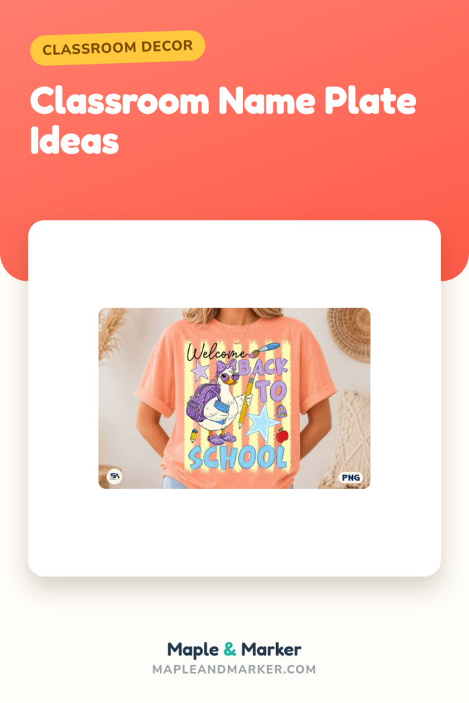
Stripes that make every name look intentional
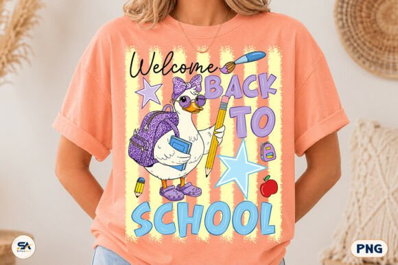
I printed this stripe set the first week of school when my room still smelled like floor wax. The stripes give you a clean band across the top and bottom of a name plate so even my worst handwriting on the kid’s name looks like I planned it. I run them through the laminator and the colors stay crisp.
What I love is they read as a theme without screaming one. I matched the desk plates to a strip on the door and one parent thought I hired someone. I did not. I printed it on the workroom copier between bus duty and morning meeting.
One honest nitpick. The stripes are bold, so if a kid has a long name it gets a little squeezed in the middle band. I bumped the print size up a notch and it fixed itself, but you will want to test one before you run a class set of twenty-four.
Little doodles the kids will not stop touching
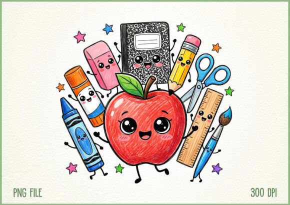
My second graders the year I looped down went feral for these tiny doodles. Pencils, apples, little smiling erasers. I tucked one doodle in the corner of each name plate and let kids pick which one was theirs, which bought me about four minutes of calm on the first day, and four minutes is real money in September.
They print soft and cute, not babyish, so I have used them on a third grade set too without anyone groaning. Slide them in a dry-erase sleeve and kids can check off a doodle as a quiet behavior thing.
The nitpick. The doodles are light line work, so on the cheap copier paper they came out a little faint. On real cardstock they pop. If your copier is as tired as mine, splurge on the heavier stock for this one.
A glitter paper backdrop for the fancy name plates
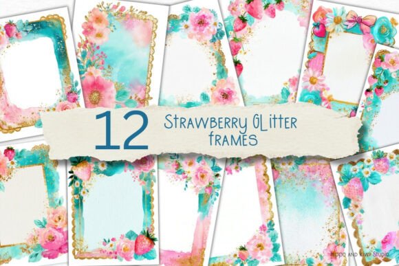
I did not buy this for name plates at first. I bought the strawberry gold paper to back a bulletin board. Then I printed name plates on plain white, mounted each one on a small rectangle of this paper, and suddenly they looked like something off a magazine instead of something off my copier.
The gold catches the window light in the afternoon and the strawberries are small enough to feel grown-up, not theme-park. I used it for our reading corner labels too and just kept going.
One thing to flag. It is a digital paper, so the glitter is printed, not actual sparkle. Up close a kindergartner might poke it expecting texture and be mildly betrayed. From three feet away it is convincing. I print it on matte stock so it does not glare under the fluorescents.
A retro design that ended up on my desk, not a kid’s

This one is technically a teacher shirt design, but hear me out. I printed the retro art on a sturdy card and made my own desk name plate with it, the kind that sits on the front of my desk so a sub or a visitor knows whose room they wandered into. The seventies colors match nothing and everything, which somehow works.
It also lives on my water bottle and a tote, because once you have a PNG you start putting it on things. I am not proud of how many things.
Honest nitpick. The retro palette is warm and a little muted, so against a busy bulletin board it can disappear. I gave mine a thin white border to lift it off the wall. Easy fix, but you will want to do it, not skip it like I did the first time.
One pattern bundle for every name plate in the room
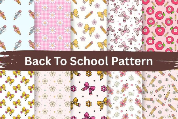
When the new teacher down the hall asked how my desks all matched, this bundle was the answer. Seamless patterns mean I can fill any size rectangle behind a name and never see a seam or a weird cutoff. I used one pattern for the name plates, a second for the cubby labels, a third for the calendar, and the room finally looked like one room instead of three.
It tiles cleanly, which sounds boring and is actually the whole point. No fighting the corners at midnight.
The nitpick is just volume. It is a bundle, so the first time you open it you will spend twenty minutes deciding instead of printing. I made myself pick three patterns and close the folder. Otherwise you lose an evening to swatches.
Apple clipart that labels the second grade desks
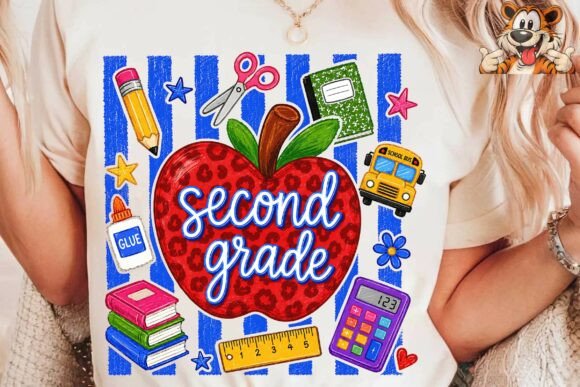
My teammate teaches second and I made her a set of these before she even asked, because that is the kind of friend I am when I have a working laminator. The little apple sits next to each kid’s name and quietly says which grade this is, which helps on the days a kindergartner wanders in lost.
The apples print clean and the red is true, not orange, which matters more than you would think. I have seen apple clipart come out looking like tomatoes. Not this one.
Nitpick. It leans classic apple-on-the-desk, so if your room is going for a moody boho calm vibe, the bright red will fight that. For her cheerful primary room it was right. For my muted third grade walls I went a different direction.
The third grade version that lives on my own desks
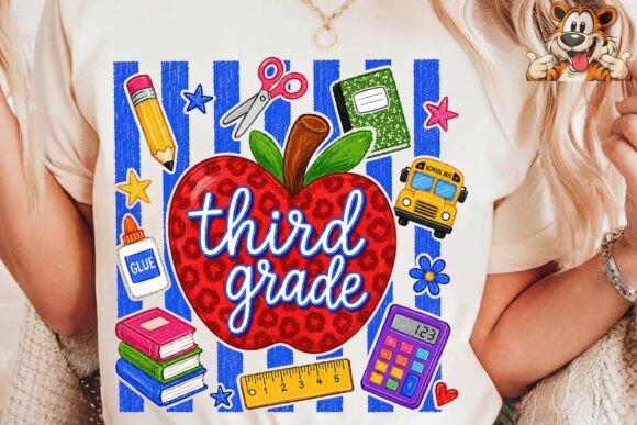
This is the one I actually use in my room. Same friendly apple idea, sized and styled for third grade, and I put a small one on the bottom corner of every desk name plate so the whole set has a thread running through it. Nine years in and I still find it satisfying when everything matches.
I printed twenty-four of these in one copier run and laminated them in a single long strip before cutting, which saves so much pouch waste. Learned that trick from a retired teacher who hoarded laminate like gold.
The nitpick. The apple is sweet but it is the same motif as the second grade set, so if you teach a split or share a hallway, the grades look almost identical at a glance. I added a tiny number to mine to tell them apart from across the room.
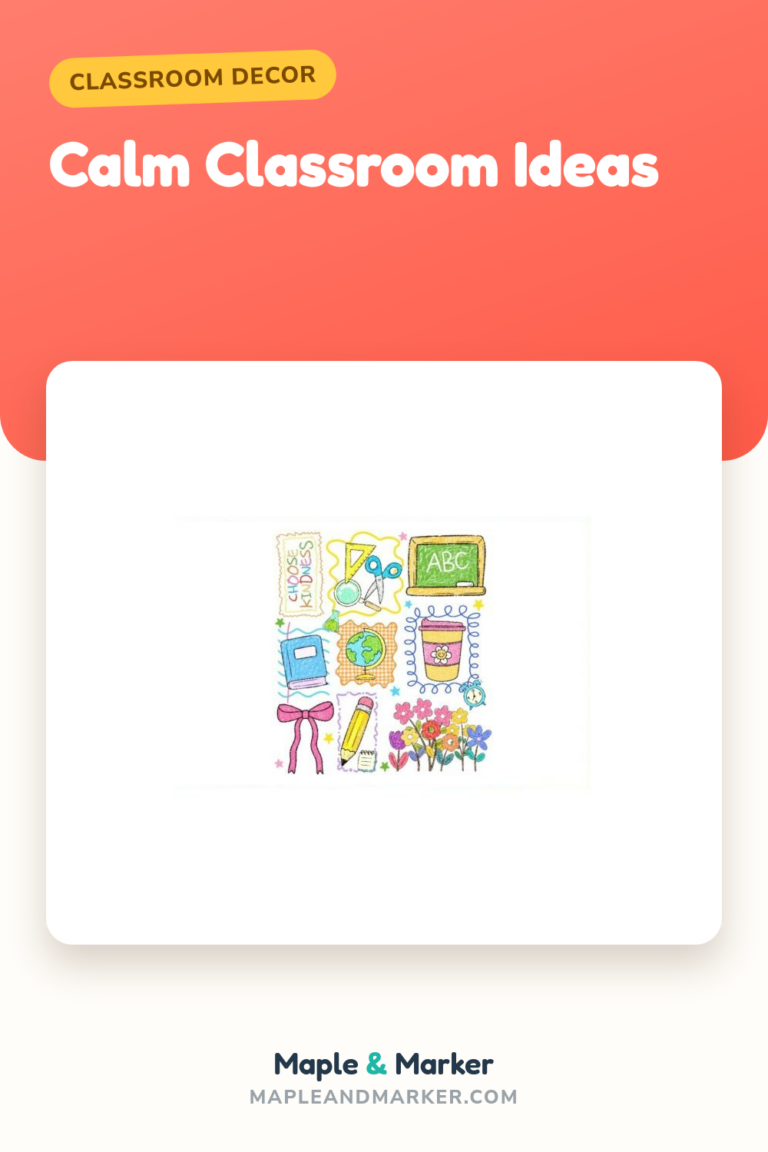
Pencils, bows, and stars for a softer name plate
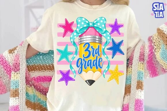
When I wanted my third grade name plates to feel a little more pulled-together than a plain apple, I switched to these. Pencils, small bows, scattered stars. It reads sweet without being frilly, and the stars give me something to repeat on the door and the job chart so the room feels connected.
I printed these on cream cardstock instead of bright white and it warmed the whole thing up. My student teacher said it looked like a calm classroom, which was the entire goal that year.
Honest nitpick. There is a lot going on in the clipart, so on a small name plate the bows and stars can crowd a long name. I used just the pencil for the longer names and saved the busier elements for the short ones. A little fussy, but worth it.
A laser-cut welcome sign for the room, not just the desk
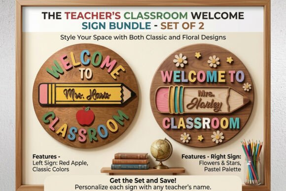
Full honesty, this is a laser-cut file and I do not own a laser cutter. What I do have is a neighbor with a craft business who owed me a favor, and she cut me a wooden welcome sign for the door that ties my whole name plate theme together. The desks say who sits where, the door says whose room it is.
The sign has lived on my door for two years now and survived a fire drill where it got knocked off and stepped on. Tougher than the laminated stuff, honestly.
The nitpick is obvious. If you do not have access to a cutter, this one is not a print-it-tonight file. Check your library or a maker space first, or find a teammate who knows someone. It is worth the hunt, but it is a hunt.
A teach-love-inspire banner above the name plates

I printed this one big and put it on the wall right above the row of desk name plates, so the kids’ names sit under teach love inspire all day. Cheesy? Slightly. Did a parent at conferences get a little teary about it? Also yes. I will take the cheesy win.
It scales up well. I printed it across four sheets, taped them, and laminated the strip. The lettering stayed sharp even at poster size, which is not always true when you blow a PNG up.
The nitpick. Tiling a design across four pages means matching the seams, and I rushed it the first time and had a visible jog in the middle. Do it slowly, line up a letter at each seam, and tape from the back. Or just print it smaller and skip the drama.
An odd one out that became the science corner
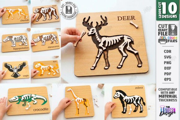
This is the wild card. Animal skeleton laser-cut files have nothing to do with name plates, and I bought them for a completely different reason during our animals unit. But they ended up labeling the science corner, with each kid’s name on a small card next to a skeleton when they had station duty.
The kids were obsessed. A reluctant reader who would not touch a worksheet spent twenty minutes telling me about the rib cage. I count that as a win for a file I bought on a whim.
Nitpick, and it is a real one. This is a CNC and laser file, so it is for cutting machines, not the copier. If you do not have a cutter, this is not the file for you. I had mine cut as a one-off and would not have bought it just for name plate duty. It earned its keep on the unit, not the desks.
Doodle frames that turn any name into a name plate
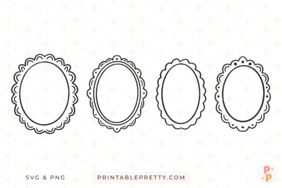
These doodle frames are my secret weapon. Drop a kid’s name inside a frame and you instantly have a name plate, a cubby tag, a job chart slot, whatever you need. I used the same frame on twenty-four desks and the room read as one set without me buying a single matching thing.
The hand-drawn frames have a wobble to them that hides my own imperfect cutting, which is the real reason I love them. Crooked scissors plus a wobbly frame equals nobody can tell.
The nitpick. There are a lot of frame options, and a few are so detailed they swallow a short name. I kept a couple of simple ones for actual name plates and saved the busy ones for headers and signs. Pick your two or three workhorses and ignore the rest.
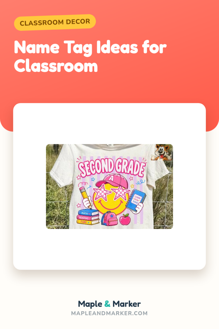
Groovy lettering for the kids who think apples are babyish
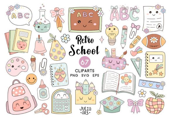
By the time I had a class of older third graders who rolled their eyes at apples, I needed something with more attitude. This groovy school set has that retro bubble lettering the kids actually think is cool, and I built the name plates around it for a back-to-school week that did not feel like first grade.
The wavy letters print bold and survive the laminator without bleeding. I matched it to a groovy door sign and the older kids were weirdly proud of their desks, which never happens.
Honest nitpick. The groovy style is loud, so a full class set of it can get visually noisy on the desks. I toned it down by using the groovy lettering just for first names and keeping the rest of the plate plain. All groovy, all the time was too much. A little goes a long way.
A whimsical bundle to fill in the gaps
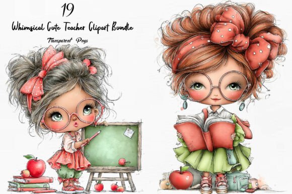
I bought this whimsical teacher bundle in June when I was theme-planning on my porch, and it became the connective tissue for my name plates the next fall. Little teacher doodles, supplies, soft shapes. Whenever a name plate looked too plain, I dropped one whimsical element in the corner and it was done.
The range is the selling point. One bundle covered name plates, welcome cards, and the sub folder cover, all in the same friendly style. My substitute left a note saying the room felt calm and organized, which, given it was me, is a small miracle.
Nitpick. Like any bundle it is a lot at once, and a few pieces are cuter than useful. I dragged my five favorites into a folder labeled USE THESE and pretended the rest did not exist. Otherwise I would still be scrolling.
Frequently Asked Questions
what is boho style decor
In a classroom, boho decor is the soft, earthy, slightly undone look. Think muted colors, natural textures like wood and woven baskets, hand-drawn shapes instead of crisp clip art, and plenty of breathing room on the walls.
For name plates it usually means cream or kraft backgrounds, simple frames, and one or two warm accent colors instead of a rainbow. I leaned this way the year I wanted my room to feel less loud, and a parent told me it felt like walking into a coffee shop. I took the compliment.
what is modern boho decor
Modern boho keeps the warm, earthy boho feel but cleans it up. Straighter lines, more white space, a tighter color palette, and less of the heavy macrame look. It is boho that went to the container store.
In my room that meant simple striped or framed name plates in two muted colors, nothing fussy, lots of negative space around each name. It photographs beautifully for the back-to-school post and, more importantly, it does not overwhelm the kids who get distracted by busy walls.
what is modern boho interior design
Modern boho interior design is the home version of the same idea: neutral base, natural materials, a few warm accents, and intentional simplicity instead of clutter. People use it in living rooms, but the principles steal beautifully into a classroom.
I borrow the rules without buying the furniture. Neutral background paper, one accent color, natural-looking textures in the clipart, and I resist the urge to fill every inch. The hardest part for a teacher is the empty space. We are wired to fill it. Modern boho asks you to leave some alone.
what is calm classroom
A calm classroom is one where the room itself is not adding to the noise. Lower-contrast colors, less clutter on the walls, organized labels, and decor that supports the kids instead of competing with them for attention.
Name plates are a sneaky big part of this. Twenty-four loud, mismatched plates create visual chaos before a kid even sits down. A matching set in soft colors, with each name easy to read, makes the desks feel settled. The year I switched to a calm setup, my most distractible student told me the room felt quieter, and we had not changed a single decibel.
If you take one thing from all this, let it be that you do not need the boxed set from the teacher store. Pick a style you actually like, grab a printable or two from a shop, and run a class set on the copier before the bell. The kids will peel them anyway. Better to print cheap and print again.
Start with one row of desks this week. See how it feels, tweak the colors, then do the rest. Your room does not have to be done by the first day, no matter what the perfect ones online suggest. Mine never is, and we turn out just fine. Go tape something crooked and call it character.