The summer I tried to go boho I bought a pampas grass plant for my reading corner. By the second week of school a fifth grader who was waiting for his sister yanked a stem out and tickled someone with it. The plant did not survive September. Neither did my hot glue gun, which I left on overnight and found welded to a paper plate.
So I stopped trying to build a magazine room and started printing the look instead. Warm tan and terracotta, little arches, soft greenery on paper that I can swap out when it sags. That is really all boho classroom ideas come down to once you take out the expensive parts. Calm colors, rounded shapes, and decor you can replace for the cost of cardstock.
Everything here I printed myself, mostly on the workroom copier, mostly the week before a staff meeting. A few of these I laminated and regret it, and I will tell you which. There are affiliate links below, so if something catches your eye I get a tiny cut at no extra cost to you.
A quick note, teacher to teacher: some links below are affiliate links. If you grab a file I may earn a little, at no extra cost to you.
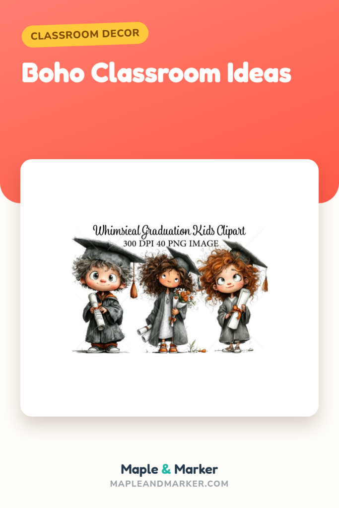
Little graduate doodles that work all year, not just in May

I almost skipped this one because of the word graduation. Then I opened the bundle and the kids in it are just soft, round, sweet little figures in muted caps, and they fit the warm boho palette better than half the back to school stuff I own. I printed a strip of them along the top of my job chart.
I used the lighter tan figures for our “moving up” wall in spring, but the rest of the year I tucked single characters into name tags and reward coupons. They shrink down clean. At business card size you can still tell who is who.
My nitpick is that a couple of the figures have very pale outlines, so if you print on cream cardstock like I did they almost disappear. I had to bump the contrast and reprint two of them. Pure white paper would have saved me a step.
Calendar numbers with a honeycomb texture that hides marker bleed
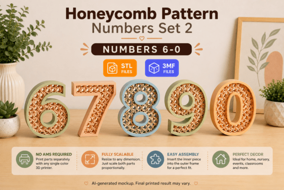
My old calendar numbers were primary-color circles that screamed at the whole room. These are terracotta and tan with a soft honeycomb pattern, and they instantly made my calendar look like it belonged with the rest of the boho corner.
I printed two sets, laminated one for the pocket chart, and left the other flat as backup. The flat ones I tape over birthdays. Here is the small win: when a kid grabs the date with a sticky hand, the honeycomb texture hides the smudge way better than a flat color did.
The nitpick is sizing. They print a hair smaller than my old numbers, so in my standard calendar pockets there was a gap at the bottom. Not a dealbreaker, but I ended up backing each one on a scrap of kraft paper to fill the space, which was an extra twenty minutes I did not plan for.
Doodle kids for the door that survived my first week
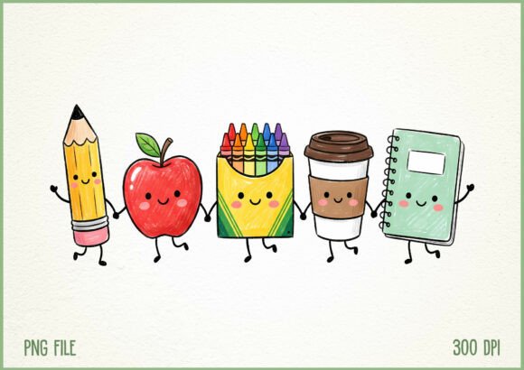
My door is the first thing parents see at open house and I am bad at doors. These doodle characters saved me. They are loose, hand-drawn little kids in soft colors, and I just printed eight of them, cut around the outline, and taped them around a paper arch I made from kraft paper.
I laid them out at different heights so it looked less like a worksheet and more like a crowd. Took me one prep period. A parent asked if my student teacher drew them, which I took as a compliment to the file.
The honest part: cutting around the loose outlines is fussy. The doodles have little gaps and stray lines, and if you cut too close they look chopped. I cut a small border of white around each one instead, which reads fine from a few feet but looks sticker-ish up close.
Watercolor fish that pull off a coastal boho corner
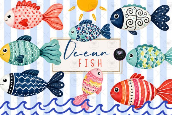
Boho does not have to mean desert tones. I leaned coastal in my reading nook one year with soft watercolor fish in dusty blues and sandy oranges, and it sat really nicely next to the tan and terracotta everywhere else.
I printed a few large fish for the wall above the book bins and a sheet of tiny ones to use as book-return markers. The watercolor edges are soft enough that they do not fight the rest of the room. My class voted to name the biggest one Gerald.
My nitpick is the file leans more aquarium than ocean, so if you want a strict beach palette a couple of the brighter fish stick out. I just did not print those two. Easy fix, but worth knowing you will cherry-pick rather than use the whole set.
Soft apples for the littles without the cartoon-red overload
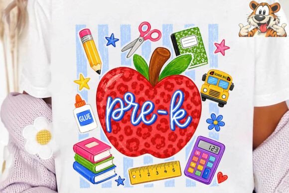
I borrowed this one for my niece’s pre-K room because the apples are muted, almost blush and sage, instead of the fire-engine red apple you see everywhere. It is the rare apple set that fits a boho palette.
We printed them as cubby labels and as a little welcome banner over the sink. On cardstock they held up to little hands all of September, which in pre-K is basically forever. The soft tones also photographed well for the class newsletter.
The nitpick is that a few apples have very thin stems that nearly vanish when you shrink them down for labels. At cubby-tag size one of them looked like a tomato. We just used the chunkier apples for the small stuff and saved the delicate ones for the banner.
Pencils with little bows for name tags that actually feel boho
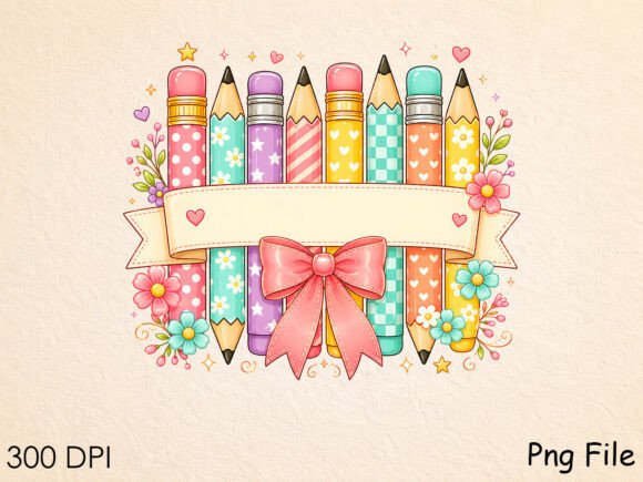
Name tag ideas for school usually end with me printing a plain rectangle and calling it done. This pencil and bow set finally got me to make tags I liked. The bows are soft and the pencils are a warm muted yellow, not neon, so they sit right with the boho look.
I printed two to a tag, laminated a class set for desks, and made a few extra for our supply bins. The bow gives them a little personality without being too much. New kids who join midyear get one too, which they always notice.
My nitpick: the bows have fine detail that gets muddy on the workroom copier if you do not run it on the photo setting. My first batch looked like little smudges on sticks. The good printer in the office fixed it, but plan to use the nicer machine for these.
Retro school art for a 70s-leaning boho board
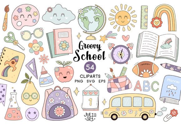
Boho and retro overlap more than you would think, and this set leans into warm 70s mustard and rust tones. I used it for a back to school bulletin board with a big paper sunburst, and it tied together with my terracotta accents without me planning it.
I printed the buses and books large for the board and the smaller items for a matching welcome sign. The retro color story did a lot of the work for me. My teammate two doors down asked where I bought the “vintage poster,” which was just a copier printout taped to bulletin paper.
The nitpick is that the retro palette is specific, so it will clash if the rest of your room is cool-toned or pastel. In a warm boho room it sings. In my friend’s blue-and-green room we tried it and it looked like it wandered in from a different decade. Match it to your warmth.
Apple and supply art for soft little classroom-theme ideas for 3rd grade and down
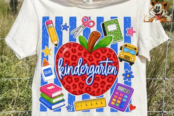
I keep a folder of supply art for labeling everything, and this set is the muted one I reach for. Apples, crayons, and little supplies in soft, grounded colors that read calm instead of busy. It scales down to my supply caddy from third grade just as well as it works for kindergarten.
I printed a sheet, cut them out, and glued them to bin labels and the front of our shared supply tubs. The soft palette means the labels do not fight with everything else on the shelf. I also used a couple on our “need more glue” sign by the door.
The nitpick is that the file is generous with options, which sounds good until you are scrolling for ten minutes deciding. I ended up printing a contact sheet so I could see them all at once instead of opening files one by one. Worth doing if you are indecisive like me.
Bow-trimmed supply art for the teacher cart corner
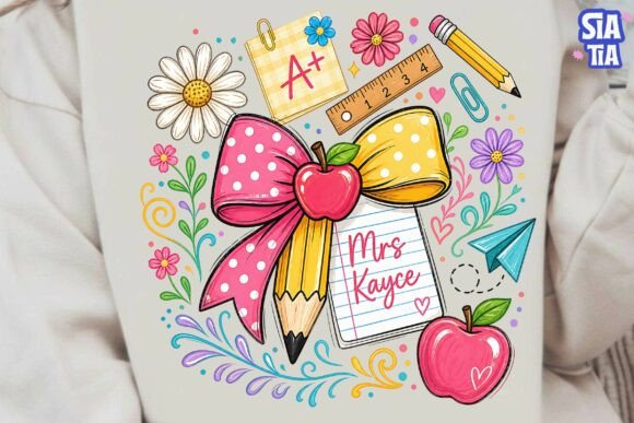
My teacher cart is the one space I decorate for myself, and this bow and supply set is exactly my taste. Soft bows, muted school supplies, a little romantic without being precious. It made my cart look intentional instead of like a junk drawer on wheels.
I printed a few and taped them to my pencil cup, my tissue box, and the side of the cart. Tiny touches, but they make me happy at 7am. A couple of my girls noticed the bows immediately and asked for matching ones on their folders.
The nitpick: this set leans very soft and feminine, so it does not blend with the rest of my classroom decor, just my personal corner. That is fine by me, but if you want one cohesive boho look room-wide, this one stays in its own zone rather than spreading everywhere.
A name sign you cut once and keep for years
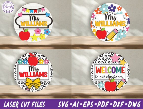
I do not own a cutting machine, but our maker space teacher does, so I sent her this name sign bundle and she ran one for me on cardstock. The lettering is clean and rounded, very boho, and it became the anchor of my door arch. One good sign pulls a whole wall together.
If you do have a machine at home, the cut lines are tidy and the bundle gives you a few style options for the layout. I went with the simplest one because I wanted it readable from the hallway, and it photographs beautifully for the class account.
The nitpick is that this is the one item here that really wants the cutting machine to look its best. I tried hand-cutting a paper version first and the curves came out wobbly. If you are scissors-only, this is the file to borrow a machine for rather than fight.
Patriotic letters I repurposed for a softer bulletin header
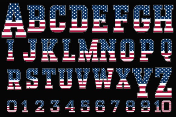
This one is a stretch for boho and I will be honest about it. The letters are flag-themed and bright, made for July. But the rust and cream tones in the worn-flag texture actually read warmer than I expected, so for a fall “welcome back, America’s future” board near our social studies wall, they worked.
I printed the letters I needed for a short header, backed them on kraft paper, and the muted version of the red and blue settled into the room better than primary colors would have. For a civics unit it was a nice tie-in.
The nitpick is obvious: this is seasonal and patriotic, not true boho. If you want a strictly neutral room, skip it. I used it for a specific board and a specific month, and outside of that context the bold letters would fight my terracotta everywhere. Use it with a plan, not as a default.
An activity book that bought me a quiet sub day
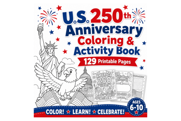
Not decor, but it earned its place in my back to school folder. This is a printable activity book tied to the U.S. 250th, and I ran it off for a sub day in early September when I knew my regular plans would fall apart without me there.
I printed a class set, stapled them, and left them with my emergency folder. The sub later told me it kept the room calm during the awkward after-lunch stretch, which is the highest praise a sub can give. The pages are varied enough that fast finishers did not riot.
The nitpick is the page count. Printing and stapling a class set ate a full prep period and a lot of toner, and the workroom stapler jammed twice. Worth it for the sub day payoff, but do it the afternoon before, not in a panic that morning.
A gentle affirmation print for the spot kids stare at
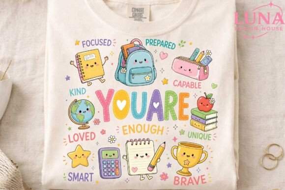
I hung a “you are enough” print right by the pencil sharpener, which is where my anxious kids tend to drift when they need a second. The lettering is soft and the supply doodles around it are muted, so it fits the boho corner instead of looking like a generic poster.
I printed it at a half-sheet size, laminated it because this one actually earns the lamination near a sharpener, and taped it at kid eye level. One of my quieter students reads it under his breath some mornings. That alone justified the print.
The nitpick is that the affirmation wording is fixed, so you take it as is. I wanted to tweak the phrase slightly for my room and could not. If the exact words work for you, great. If you are picky about phrasing, know that what you see is what you get.
Grade-specific art I bent to fit my third grade door
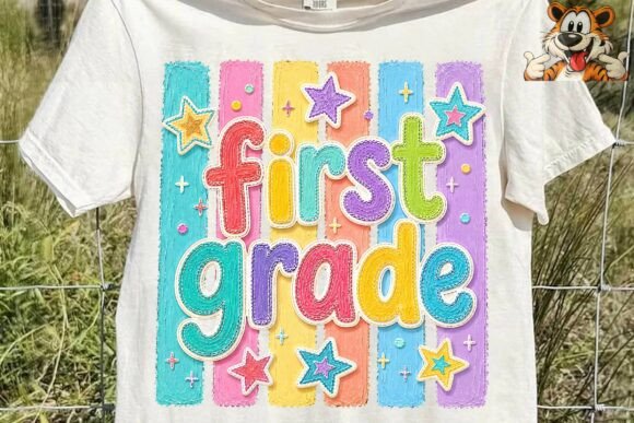
The file says first grade, but the teacher figure and supply art are soft and neutral enough that I used them anyway for my third grade welcome setup, just cropping out the grade text. Good boho-toned teacher art is hard to find, so I am not picky about the label.
I printed the teacher character for my name sign area and the little supply pieces as accents around the door arch. The muted palette matched everything else, and from the hallway nobody is reading fine print about grade levels.
The honest nitpick is right there in the name: it is grade-labeled, so if you teach anything but first you are cropping or hiding text. That worked for me, but if you want a piece that says your grade out of the box, this one makes you do a little editing first.
Frequently Asked Questions
what is boho style decor
Boho decor is the warm, layered, slightly undone look you see with tan and terracotta colors, natural textures, soft greenery, and rounded shapes. Think earthy instead of bright, cozy instead of matchy.
In a classroom it mostly means swapping loud primary colors for muted warm tones and adding a few soft natural touches. You do not need real plants or macrame. Printed art in the right palette gets you most of the way there.
what is modern boho decor
Modern boho keeps the warm, earthy boho feeling but cleans it up. Fewer busy patterns, more open space, simple arches and clean lettering mixed with the natural textures.
For my room that meant choosing rounded fonts, leaving some wall space empty instead of filling every inch, and sticking to two or three warm colors. It looks calmer and is honestly easier to pull off than the maximalist version.
what is modern boho interior design
Modern boho interior design is the home version of the same idea: neutral warm backgrounds, natural materials like wood and woven textures, and a few statement plants or arches, all kept simpler and more minimal than classic bohemian style.
The classroom translation is straightforward. Warm neutral bulletin paper instead of bright, simple shapes, and restraint. You are borrowing the calm, grounded feeling, not trying to recreate a whole living room on a teacher budget.
what is calm classroom
A calm classroom is a room set up to feel low-stress on the eyes and the nervous system. Softer colors, less visual clutter on the walls, and cozy spots a kid can settle into. The decor choices support behavior, not just looks.
Boho and calm overlap a lot, which is why I drifted this direction. Muted warm tones are easier to look at all day than bright primaries, and a less busy wall genuinely seems to help my wigglier kids focus. That is the part I care about most.
You do not need a die-cut machine, a real plant that survives a fifth grader, or a craft store budget to get the boho look. You need a warm palette, a few good printable files, and a copier you are on friendly terms with. Print flat, swap things out when they sag, and let the colors do the heavy lifting.
Start with one wall or one corner, not the whole room. I redid my reading nook first and lived with it a week before touching anything else. Go gentle on yourself, keep your flash drive labeled, and try not to leave the glue gun on overnight like I did. You have got this.