The week before open house I tried to make one clean rules poster. Just one. Big chart paper, four rules, a marker, twenty minutes. My handwriting drifted uphill by rule three, the marker dried out on the word “respect,” and I finished it in a different color that looked like I gave up halfway. Because I had.
So I quit drawing the chart by hand and started building it out of printed pieces instead. A bold header up top, the rules in clean type, and little graphic panels around the edges so the whole thing reads like a poster and not a punishment list. A rules chart is the one poster you tape at kid eye level and point at every day until June. It has to look intentional from the carpet and survive a thumbtack being yanked out of it.
These are the classroom rules chart ideas I actually printed and hung last fall. Small digital files from an indie design shop, run off on cardstock, taped into one chart on my back wall. A couple earned me a little commission, and I kept the part where each one let me down.
A quick note, teacher to teacher: some links below are affiliate links. If you grab a file I may earn a little, at no extra cost to you.
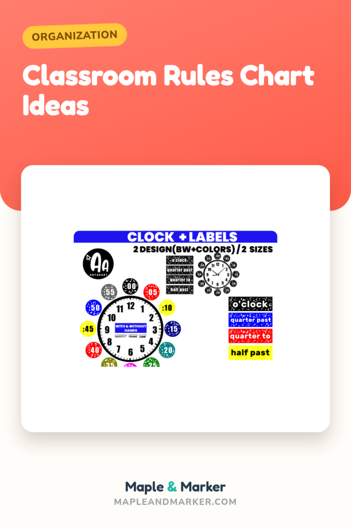
Clock labels that turned my “on time matters” rule into a poster
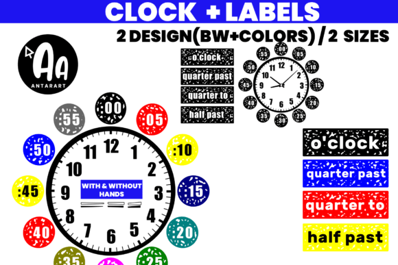
One of our rules is about coming back from specials ready to go, so I built that part of the chart around time. These little clock labels with the minutes spelled out went up in a row beside the rule, and now I tap the clock that matches when we are supposed to be back. The kids who cannot read an analog face yet follow the printed minutes instead.
I printed them at about three inches on cardstock, cut them over the sink during planning, and stuck them up with a glue stick so I could re-order them when our schedule shifted in October.
The honest catch: it is really a math-corner set, so a chunk of the labels are about teaching time, not displaying it. For my rules chart I used maybe a third of them and filed the rest. Good for that third, not the whole pack.
A “world’s best” panel for the top corner of the chart

A rules chart can read like a list of don’ts if you let it, so I tuck something warm in the top corner to set the tone. This “world’s best” graphic went up there, a little badge that says the room is proud of itself before it lists a single rule. It softens the whole poster.
I printed it about five inches on the copier, no color shift, clean enough lines that I could have cut a stand-up version for my desk if I wanted.
The nitpick: the phrase is generic on purpose, which is handy, but it is also a touch loud next to plain rule text. I had to keep the rules underneath dead simple, black on white, or the corner badge started competing with the actual rules. Nice accent, demanding neighbor.
A glowing-teacher graphic for the encouragement strip

Down the side of my rules chart I run a thin strip of encouragement, little reminders that following the rules is what makes a good day, not just rules for the sake of rules. This “glowing” teacher graphic anchored the top of that strip. It is sunny in a way that takes the bossy edge off the poster.
It printed bright and held its color under the window, which not everything does on my copier. I cut it out by hand and the edges were clean, no thin tearaway bits.
The honest part: it reads more teacher-celebration than kid-facing, so a few of my fourth graders did not really clock that it was about them. It works as decoration on the chart more than as a message they absorb. Cute, just slightly aimed at the grownup.
A love-language panel to bookend a kindness rule

Our first rule is the kindness one, and I wanted art near it that matched the feeling instead of fighting it. This “love language” graphic went right beside that rule. It made that part of the chart read soft and on purpose, like the rule and the picture were saying the same thing.
I printed it on plain copy paper at about four inches because the lettering style reads better matte, cut it, glued it next to rule one. One planning period, done.
The catch: it is wordy art, a whole phrase in a decorative font, so up close it competes with the rule text right next to it. I had to leave a fat gap between them or the eye could not tell which words were the rule. Charming, but it needs breathing room.
A “vibes only” header if your chart leans casual

My teammate two doors down teaches fifth and wanted her rules chart to feel less schooly, more like a poster a kid would actually choose to hang. This “vibes only” graphic became her header. It set a relaxed tone over a list that, let us be honest, is still a list of rules.
She printed it big on the office printer, almost eleven by seventeen, and built her rules in plain type underneath so the fun header and the readable rules stayed in their own lanes.
The nitpick we both noticed: the casual phrasing skews older. On my fourth grade wall it felt a little too cool for the room, and the younger kids did not connect with it. Great for her fifth graders, slightly off for mine.
A specialty graphic that found a home on a different chart

This “teacher of the gifted” graphic was an honest mismatch for my general rules chart, so I am telling you straight: I did not use it on the main poster. Our gifted pull-out teacher down the hall did, on her own small rules chart for that room, and it fit her space perfectly.
She printed it about six inches, taped it at the top of her chart, and it told visiting kids whose room they had walked into before they read a word.
The catch is right in the title: it is locked to one specific role. If that is not your assignment, this exact file does nothing for your chart. Lovely for the one teacher it was made for, a pass for everyone else. Worth saying plainly so you do not buy it expecting general use.
A teacher-life graphic for the corner that nobody reads

Every chart has a dead corner, the one spot your eye skips. I started filling mine with a small fun graphic so the poster looks finished instead of lopsided. This teacher-life design took that job on my rules chart, bottom right, just enough to balance the header up top.
It printed clean and small, the line work cut out without fuss, and it survived a thumbtack going straight through it without tearing, which is the real durability test for a corner piece.
The nitpick: it is firmly a grownup-humor graphic, so it is genuinely just for me and the visiting adults. The kids do not read it. I knew that, and I am fine with a chart that has one private joke on it, but do not expect it to do any teaching.
A “club” graphic to make the chart feel like a team

I like a rules chart that says “this is how our club acts,” not “obey me,” so I look for art that builds a we instead of a you. This “club” graphic helped. I put it near the header, and it nudged the whole poster toward belonging. The rules read like membership instead of orders after that.
It printed bright on cardstock and the bold style held up at small and large sizes, so I made a tiny matching copy for the door to carry the theme out of the room.
The honest catch: the design leans heavily on one word, and if your chart already has a busy header, two strong word-graphics in one spot turn into noise. I had to pick one as the star and shrink the other. Strong piece, do not double up.
A simple number-one graphic to anchor the top rule

I number my rules so I can say “that is a rule one choice” without re-reading the chart, and I wanted the number one to stand out since it is the kindness rule. This clean “1” graphic became that anchor. It sits right at the top of my rules column and gives the most important rule a little crown.
It printed sharp at a small size, the saturated style survived the copier and the window glare, and the simple shape cut out fast, no fiddly edges.
The nitpick: it is one design, not a numbered set, so I only got my rule one styled this way and had to plain-text the rest. If you want all four rules numbered to match, this single file leaves you hunting for the others. Great for the headline rule, incomplete for the list.
A plain teacher graphic for filling the chart border

Sometimes I do not need a statement, I just need to fill space along the edge of the chart so it does not look bare. This basic teacher graphic was my filler. I printed a few, cut them small, and spaced them down the empty side of the poster so the rules had a tidy frame.
I ran a whole sheet at once, dropped the cutouts in a little baggie, and pulled them out whenever a corner of the chart looked thin. Cheap way to keep a poster looking finished all year.
The catch: plain means plain. It is pleasant and it does the job, but it adds nothing memorable, so do not expect kids to notice or care about it. It is wallpaper for the chart, and that is genuinely all I wanted from it.
A teach-love-inspire panel for the bottom of the chart

I like to close a rules chart with a line about why the rules exist, and this “teach love inspire” graphic gave me that without making me letter it by hand. It went along the bottom edge, under all four rules, like a quiet footer that ties the poster together.
I printed it long and low on the office printer, cut it into a strip, and taped it under the rules so the chart had a clear top, middle, and bottom. It reads as deliberate now instead of stopping wherever the chart paper ran out.
The nitpick: the script font has a couple of letters that my slower readers squinted at from the carpet. It works as a decorative footer, not as something every kid will actually read. Pretty, just not the place for your most important words.
A second teach-love-inspire style for a calmer footer

This is the near-twin of the last one, a teach-love-inspire design in a calmer layout, and it is the version I actually kept up past winter break. The cleaner spacing read better from across the room, so when I rebuilt the chart in January I swapped the busier footer out for this one.
I printed it on plain matte paper since the muted style hides copier streaks better than glossy bright files, cut it into a strip, and taped it along the bottom edge of the rules.
The honest catch: having two versions of basically the same phrase meant I paid for one I did not end up using on the main chart. The retired one went onto a smaller side poster, so it was not wasted, but I would pick one layout up front if I did it again.
A seasonal graphic to refresh the chart in October

A rules chart that never changes goes invisible by week six, so I swap one small piece each season to make kids look at it fresh. In October this spooky teacher graphic took the top corner for a few weeks. Same rules, new little accent, and suddenly everyone was reading the chart again to find the new thing.
It printed bright and bold on cardstock, which is exactly the saturated look that survives the copier, and I taped it lightly so I could pull it back off in November without wrecking the corner underneath.
The nitpick: it is firmly a fall, late-October piece. It looks out of place by Thanksgiving and ridiculous by December. A short-season swap, not a year-rounder. I knew that going in, but worth flagging so you budget it as a few-weeks file.
A pre-K graphic if your rules chart lives in an early room

My student teacher moved on to a pre-K placement this spring and asked what art would fit a rules chart for the littlest kids, where the chart is more pictures than words anyway. This pre-K graphic was the one I pointed her to. The big friendly style reads from across a carpet full of four-year-olds, which is the only audience that counts at that age.
She printed it large, taped it at the top of a mostly-picture rules chart, and built each rule as one image with two or three words under it. The graphic set the grade and the tone in one piece.
The honest catch: it is welded to pre-K in the wording, so the moment you teach anything older it is off the table. Right at home in her placement, useless one room up. If you are not in an early-childhood room, skip it.
Frequently Asked Questions
what is a sub plan
A sub plan is the packet you leave behind so a substitute can run your room without you. Mine has the day’s schedule, who eats what at lunch, which kid needs to sit near the front, where the bathroom passes live, and a couple of easy lessons that do not need me to teach them.
I keep a generic emergency version in a folder by the door that any sub can grab if I wake up sick at six in the morning. The day my own kid got the flu and I had ten minutes to get out the door, that folder saved me. Build it once in August and update it when something changes.
what is classroom organization
Classroom organization is just having a home for every thing and every routine so you are not hunting at eight in the morning. Where the scissors live, how kids turn in work, what the rules chart says, where the sub plan sits. It is the boring scaffolding that makes the room run.
The rules chart is a piece of it, honestly. A clear chart on the wall is organization you can point at instead of repeat for the hundredth time. The more of your routines you can put on a wall or in a folder, the less you carry in your head.
what to put in a student teacher binder
When I had a student teacher, her binder held the class schedule, a seating chart with a few notes about which kids needed what, our class rules, a copy of my sub plan so she could see the format, and blank lesson plan templates she could fill in week by week.
I also tucked in a one-page cheat sheet of our routines, like how we line up and how we do the quiet signal, because those are the things nobody writes down but every classroom runs on. Give them the rules chart wording too, so they reinforce the same words you do.
why is classroom organization important
Because the time you spend hunting for a worksheet or re-explaining a routine is time you are not actually teaching, and it adds up fast across a year. An organized room runs on autopilot for the small stuff so you can spend your energy on the kids.
A rules chart is a tiny example of the payoff. I built mine once, hung it at eye level, and now I point instead of lecture. Every routine you can move out of your head and onto a wall or into a folder is one less thing draining you by October.
A rules chart is the one poster you will point at every single day, so build it to be read from the carpet, not just admired up close. A bold header, four simple rules, and a few graphic panels that frame the words instead of crowding them. Everything on my list is just paper I can print, cut, and re-tape when a thumbtack has its way with the corner.
Start with one header you like and one accent piece, get the rules clean and readable, and add the rest as the year asks for it. That is the chart that survives past winter break. Now go laminate something you absolutely did not need to laminate. I will be right there with you.