My welcome chart the year I moved rooms was a disaster. I had the whole thing planned on the drive in, hummed about it, felt good. Then the workroom copier ate the bottom third and spat out a gray smear, and I had eleven minutes before the buses.
So I taped up the top half and wrote the rest by hand with a fat marker that was running dry. A parent told me at meet the teacher that she loved the “intentional” blank space. I did not correct her.
That is the honest version of classroom welcome chart ideas. Not the weekend-and-a-die-cut-machine version. These are files I printed, laminated, hung crooked, and used in a real room. A few I bought from an indie design shop because building them myself would have cost me a Sunday I did not have, and the links here are affiliate ones.
A quick note, teacher to teacher: some links below are affiliate links. If you grab a file I may earn a little, at no extra cost to you.
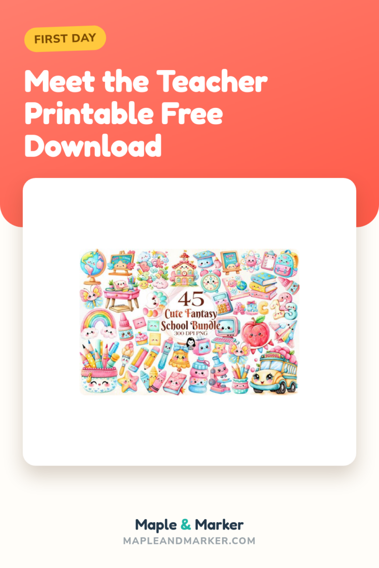
Cute supply icons for the chart that needs a little softness
I printed these little supply graphics small and scattered them around the edges of my welcome chart so the giant block of names did not look like a spreadsheet. Pencils, a ruler, an apple, that sort of thing. On cardstock they hold color better than copier paper, which goes gray on me by week three.
I laminated the ones I cut out as corner pieces. They survived a full year of being bumped by backpacks.
The nitpick. A couple of the icons sit on a faint shadow that does not vanish when you print on bright paper. If you are cutting them out tight you will be trimming a thin gray halo off the edges. Worth doing. Annoying at 7am with safety scissors.
Digital paper as the chart background that hides copier sins
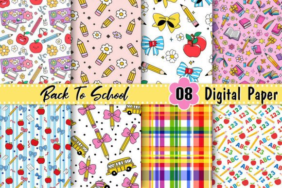
I print one sheet of this as the backing layer and tape my chart title and name cards right on top. The pattern hides the faint roller lines my workroom copier leaves on plain white. Cheap trick, looks expensive.
My student teacher used the same paper to back the cubby labels so the whole front wall matched. That part was her idea and it was a good one.
The nitpick. The darker patterns eat your toner. I ran one sheet of the navy one and the copier beeped low-toner at me like I had personally insulted it. Stick to the lighter patterns for full-page prints and save the bold ones for small accents.
A striped pencil bow to pin the chart corners down
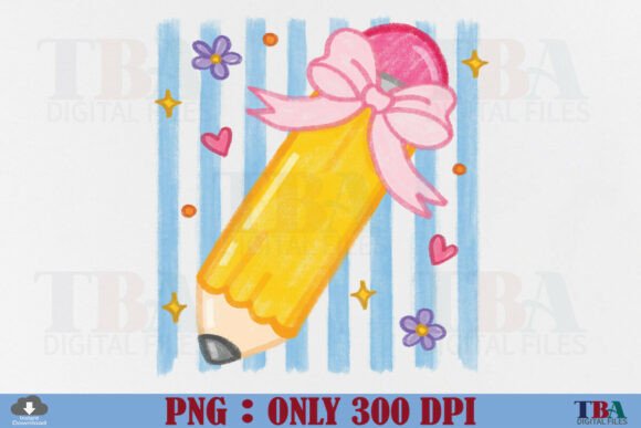
This one is pure decoration and I am fine with that. I printed the pencil-bow a few times, laminated them, and used them as the little anchor pieces in the corners of the welcome chart where the paper always wants to peel. A bow over a staple looks intentional. A bare staple looks like 7:50am.
The stripes read clean even when I shrink it down to about two inches.
The nitpick. It is one pose. Just the one bow. I wanted a left-facing and a right-facing so my two corners would mirror, and I ended up flipping it myself in the print settings, which not everyone wants to fuss with. Small thing. But I noticed it the second I taped both up.
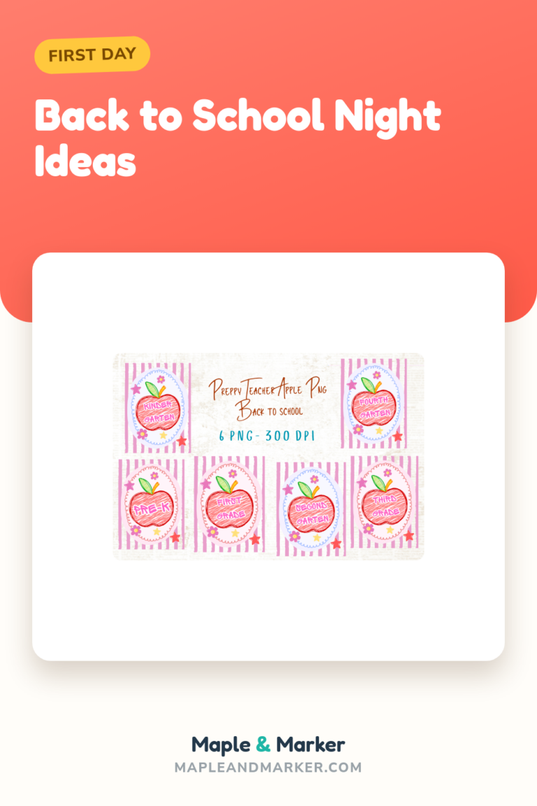
Preppy icons for a welcome chart with a color theme
The year I went all-in on a pink-and-green room theme, this icon set saved me. I pulled three or four icons that matched and used them as the repeating element down the side of my welcome chart so it felt like a set instead of random clip art I grabbed at midnight.
Printed small on cardstock, laminated, hot-glued. They have not moved since.
The nitpick. It leans preppy, like the name says, so if your room is more rainbow-primary the pastels will fight your bulletin board border. I learned that the hard way taping pastel icons over a bright red border. Looked like a mistake. Swapped the border, not the icons, because the icons were the part I liked.
Composition-notebook background for a chart that looks like school
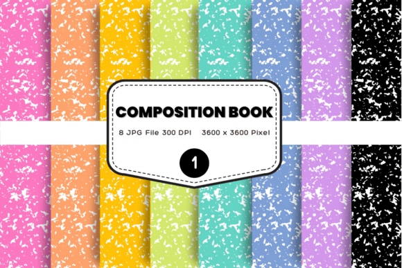
There is something about that black-and-white speckled notebook look that just says classroom. I print this as the background panel behind my welcome chart heading, and kids recognize it instantly. One of my third graders said it looked like the inside of his brain. I have thought about that all year.
It prints sharp even on the workroom copier, which does not love fine pattern.
The nitpick. The speckle is busy. If you write directly on a printout of it with marker, your text fights the background and gets hard to read from the back of the room. I keep the writing on a plain white card laid on top, and let the notebook pattern stay a frame, not a writing surface.
A friendly character to greet the chart’s readers

I tucked this little figure in the bottom corner of my welcome chart, like she is waving the kids in. The week before open house I had a blank corner that was bugging me, and one printed-and-laminated character fixed it in four minutes.
Parents at meet the teacher kept pointing her out to the little siblings. She earned her corner.
The nitpick. It is one specific character with one specific look, and a couple of my students did not see themselves in her. I added a second printed figure from a different set so the corner had two, which felt more like my actual room. If you use her, maybe do not let her be the only face on the wall.
The teacher apple as the chart’s little signature
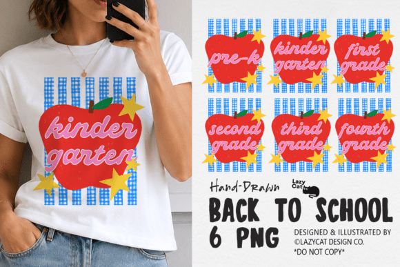
An apple on a teacher’s welcome chart is a cliche and I print it every single year anyway. I put this one right next to my name at the top, small, like a signature. It is the one piece of decor my nervous first-day kids look at and relax a little.
Laminated, it wipes clean when a marker rolls into it.
The nitpick. The red is a deep red, almost cranberry, and on my warm-white cardstock it printed slightly muddy. Not bad. Just not the bright apple-red on the screen. I would test one print before committing to a whole strip of them, because color on screen and color out of the workroom copier are two different animals.
Stacked books and apple for the chart’s anchor image
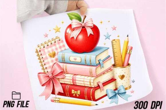
I like a welcome chart to have one bigger anchor image that the eye lands on first, and a stack of books with an apple on top does that job without trying hard. I printed this one about hand-sized, laminated it, and stuck it dead center above my class list.
It is the piece a parent photographs when their kid points at it.
The nitpick. The stack has a lot of fine detail in the book spines, and when I shrank it too small the spines turned to mush and printed as gray bricks. Keep this one at least a few inches tall. It is built to be the big anchor, not a tiny accent, and it gets grumpy when you treat it like one.
The class-of design that is more spirit night than welcome chart
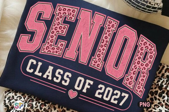
Full honesty, this one is not really a welcome chart piece. It is a class-of shirt design. But the new teacher down the hall teaches a graduating grade, and she lifted the pink-leopard lettering style off this and used it as the headline font feel for her own welcome board. So it earns a mention as a style starting point.
The leopard-print fill is the whole personality, and it is fun.
The nitpick. It says a specific year, so it dates itself fast and it is squarely a teen-grade vibe. In a lower-elementary room it reads loud and a little off. I would only reach for this if you teach an older grade and want that bold pink energy, not for a sweet K-2 welcome wall.
A grade-specific smiley to label the chart by class

When my building went to two classes per grade, a grade-labeled smiley like this one made my welcome chart obvious from the hallway. Parents on the first morning are scanning for the right room and panicking a little. A big friendly grade marker calms that.
I printed it large, laminated it, and hung it above the door and again on the chart so they matched.
The nitpick. It says fourth grade. Right there in the file. So it is wonderful if you teach fourth and useless if you do not, and there is no editing the number without design software I do not keep on the workroom computer. Check that the grade matches yours before you fall in love with the smiley. I almost printed a whole set for the wrong room.
A whole bundle to keep the chart and the room matching
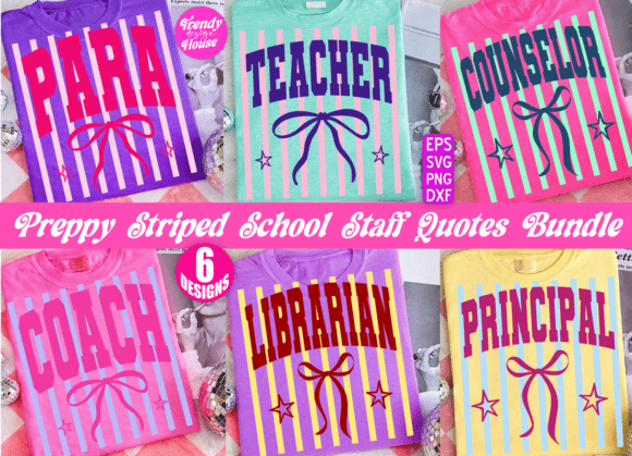
This is the one I would point a brand-new teacher to. It is a bundle, so instead of hunting down matching pieces at midnight you get a striped, coordinated set you can spread across the welcome chart, the door, the cubbies, and the calendar wall. My first year I would have cried happy tears over this. I cried other tears that year.
Everything shares one color story, so the whole front of the room looks planned.
The nitpick. It is a bundle, which means a lot of files, and the first time I opened it I spent a while just figuring out which piece was which before I printed anything. Give yourself fifteen quiet minutes to sort it before the chaos. Do not open it for the first time at 7:45am like I did.
Fruit journal covers borrowed as chart name-card backers
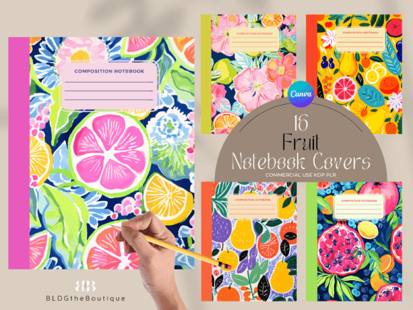
These are built as notebook covers, but I print them at name-card size and use them as the little backing rectangles each kid’s name sits on across the welcome chart. Sixteen fruit designs means sixteen kids get a different one, and they hunt for theirs on day one. The strawberry is always the first to go.
The fruit art is clean and bright and copies well.
The nitpick. There are sixteen, and if your class runs bigger than that you will be repeating designs, which two of my kids absolutely noticed and made a small thing about. I just paired the repeats with different name colors so they did not feel like twins. Works. But count your roster first.
Hand-drawn doodles for a chart with a relaxed feel
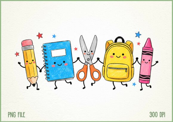
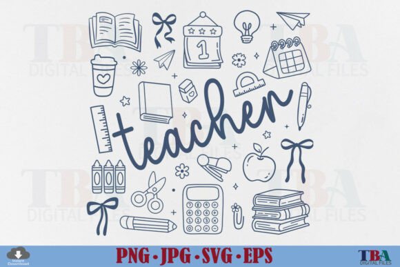
Some years I want the welcome wall to feel less polished, more like a friendly notebook margin, and these doodle supplies do that. I scattered small printed doodles around my chart heading the year my theme was basically just black marker on kraft paper. It felt warm and low-pressure, which matched how I was feeling that August.
The loose line style reads great even on a quick copier print.
The nitpick. The doodles are line-heavy and light on fill, so on a busy patterned background they vanish. I had to move mine onto plain cream paper before they showed up at all. Give them quiet space around them. They are a margin doodle, not a centerpiece, and they shine when you treat them that way.
Kawaii supplies for the chart that wants to be sweet
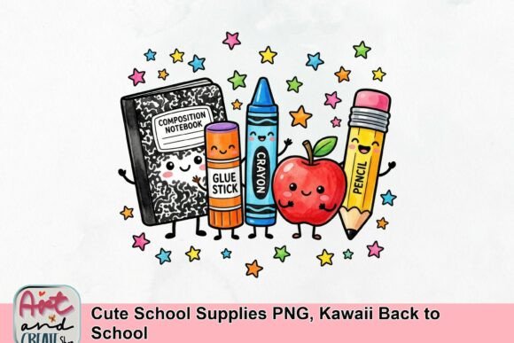
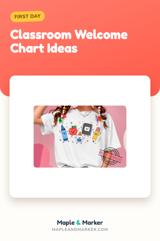
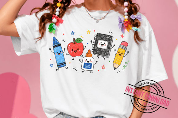
Last one, and it is the softest of the bunch. The kawaii supplies, the little faces on the pencils and crayons, are the kind of thing my younger students reach up and pat on the way in. I used these on a K-class welcome chart during a year I covered a kindergarten room, and the little faces did real work calming first-day nerves.
Printed small and laminated, they are basically indestructible.
The nitpick. The cute faces are very cute, which means in an upper-elementary room my fifth graders rolled their eyes a bit. Know your audience. These are gold for the little ones and a hard sell to a ten-year-old trying to act too cool for a smiling pencil.
Frequently Asked Questions
what is back to school night
Back to school night is the evening, usually a week or two after school starts, when parents come into the building to see the classroom and hear how the year is going to run. Kids usually stay home for this one. It is the grown-up version.
It is also the night your welcome chart gets its real audience, so it is worth having the wall finished before then, not the morning after.
what is meet the teacher
Meet the teacher is the open-house style event before or right at the start of the year where families drop in, find the room, and say a quick hello. The kids do come to this one, often clutching a parent’s hand and a fistful of supplies.
This is when a clear welcome chart earns its keep. Nervous kids find their name on the wall and settle a little, and that is the whole point of putting it up.
is back to school night just for parents
Mostly, yes. Back to school night usually runs as a parents-only evening so I can actually talk through the year without thirty kids underfoot. It is the one night I get to be heard over the noise.
Meet the teacher is the kid-friendly one. So if your event is the evening informational kind, plan it as an adult room. If it is the drop-in open house, expect the little ones too.
is back to school night necessary
Necessary is a strong word, but I would not skip it. The families who show up to back to school night are the ones I have an easier time reaching all year, and twenty minutes in person buys a lot of goodwill before the first hard email ever happens.
If your building leaves it optional, I still do a small version. Even a short window with the welcome chart up and coffee on does more than another newsletter ever will.
None of these will go up perfectly. Something will curl, the copier will jam at the worst moment, and a kid will sign the welcome sign in the wrong spot and improve it. That has been true for nine years and I have stopped fighting it.
Pick two or three pieces, print them flat, laminate the ones near little hands, and let the wall be a little crooked. The kids are not grading you on it. They are looking for their name and a friendly face, and any of these will give them that. Now go find your flash drive before you lose it. I always do.