My student teacher asked me last fall why I had three rolls of tape on my desk and not one stapler. Because the stapler is a lie, I told her. It works the day you hang the thing and quits by the time the kids notice it.
So most of my walls are paper now. Flat prints off the workroom copier, swapped out when I get bored or when a corner gives up. I went looking for fresh classroom poster ideas the August before this year and ended up buying a bunch of little digital files from an indie design shop, printing them on cardstock, and seeing which ones held.
This is that list. Stuff I hung in my own room, not a catalog. A few I’d buy again, one I almost returned, and one a kid liked better than I did. If you click through and grab something I get a tiny kickback, which mostly funds my lamination problem.
A quick note, teacher to teacher: some links below are affiliate links. If you grab a file I may earn a little, at no extra cost to you.
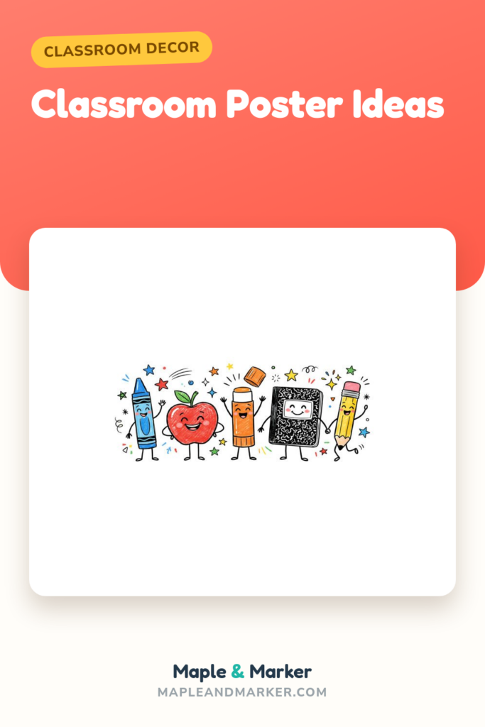
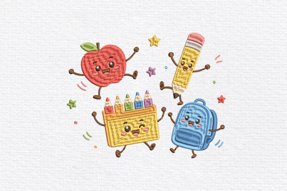
The doodle friends that filled my dead wall corner
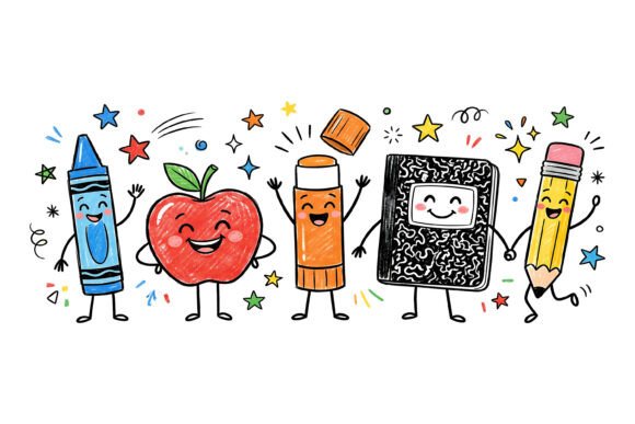
I had one of those awkward narrow strips of wall by the pencil sharpener that nothing fit. This doodle clipart fixed it. I dropped four of the little characters into a slide, printed them big, and made a stretchy banner that says READ in my room. Bright, simple, friendly without being babyish for eight-year-olds.
The line art prints clean even on the copier, which is rare. Color held up. By spring it was still flat against the wall, no sad curl.
One gripe. The figures are cute but a couple look a little same-y next to each other, so I had to space them out so it didn’t read as a repeat. Minor. Took me ten minutes.
Retro clipart for a name wall that didn’t feel like a worksheet
I wanted name plates that weren’t the same primary-color set everyone uses, so I built mine off this retro pack. Muted oranges and a faded blue, very seventies in a calm way. I printed twenty-two name cards on cardstock, taped them above the cubbies, and they actually looked intentional.
The vibe is warm. Parents at our fall night noticed, which never happens with cubby tags.
Nitpick: the retro palette runs darker, so my black name text got muddy on the deeper backgrounds. I switched my names to white and it fixed itself, but you’ll want to test one before you print the whole class.
Soft supply art that landed better in the calm corner than I expected
I almost skipped this one because nursery sounded too young for third grade. I was wrong. The soft little pencils and crayons are gentle, low-contrast, easy on the eyes, so I used them in my quiet reading nook instead of the loud part of the room.
I printed a small poster of them next to the beanbag. Two kids who get overstimulated gravitate there now. I don’t think the art did that alone, but it didn’t hurt.
The honest thing: it’s very pastel. On a bright white wall it kind of disappeared, so I backed it on a sheet of pale gray cardstock to give it an edge. Needed the frame to read at all.
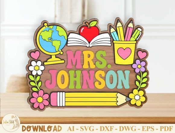
An apple poster I made into a job chart
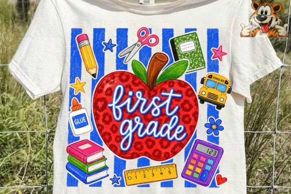
The apple art is sweet and I had a use for it the second I saw it. I printed one big apple, laminated it, and turned it into a wipe-off helper-of-the-day sign by the door. Write the name, wipe it Friday, done. Held up to nine months of dry-erase abuse.
The red is genuinely good red, not the orange-red the copier usually fakes. That mattered to me more than it should.
Where it fell short: it leans first grade, like the file name says. The apple’s a touch cutesy for my older kids and one of them called it baby stuff in October. I kept it anyway. The job still got done.
The embroidery file my teammate stitched onto our reading pillows
This one isn’t a print, it’s a stitch file, so I want to be honest that I didn’t use it on my walls. My grade-level teammate has the machine. She ran the little supplies design onto a set of throw pillows for our shared book corner and they came out clean, tight stitching, no puckering on the small details.
If you’ve got someone on your team with a machine, this is a nice way to make the soft stuff in your room match your theme instead of being random clearance pillows.
The catch is obvious: useless to me without the hardware. And she said the tiny supply shapes needed her to slow the machine down or they’d pull. So not a beginner stitch.
Retro art that became my whole September bulletin theme
I used this as the backbone of my first-month board. Faded school stuff, warm tones, a little vintage. I printed the pieces, cut them loose, and clustered them around a WELCOME BACK header I built in the same colors. It tied together better than my usual scramble of mismatched cutouts.
The consistency is the selling point. Everything in the pack shares a palette, so nothing fought.
My nitpick is that I wanted a couple more pieces than the set gave me to fill a big board, so I ended up repeating two of them on the edges. You can hide it, but a slightly bigger pack would’ve saved me the workaround.
The dinosaur poster a quiet kid finally smiled at
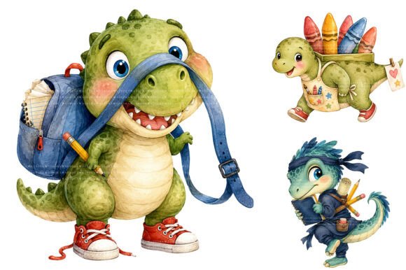
I bought this one entirely for a single student. We had a new kid in October who barely spoke for two weeks and drew dinosaurs on everything. So I printed the watercolor dino, taped it above his table spot, and didn’t say anything about it. He noticed on day three. First real smile I got out of him.
The watercolor texture prints soft and pretty, even off the copier, which surprised me. Doesn’t look cheap.
The nitpick: watercolor edges go a little fuzzy when you blow it up to poster size. Up close it’s fine. From across the room one of the dinos looked slightly blurry, so I’d keep these at the smaller print size.
The cut-file door sign I farmed out and don’t regret
This is a laser cut file, so this one I sent to a friend with a cutter rather than printing it. She made me a wood door sign with my name on it, the kind that screws into the wall and outlasts every paper thing I own. It’s the one piece in my room that looks like a grown-up made it.
Getting it personalized was simple for her, she said the file was set up cleanly with the name as its own swap-out piece.
My only complaint is on me, not the file: I picked a thin script for my name and the tiniest letters were fragile out of the cutter. Go a little bolder than you think. Hers cracked once on the first run.
Number models that turned my math wall 3D
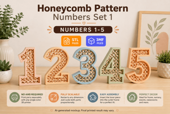
Our STEM teacher printed these honeycomb numbers on her 3D printer and handed me a set. I hot-glued them along the top of my math wall, zero through nine, and suddenly that wall had texture instead of being flat forever. Kids touch them. They count on them when they think I’m not looking.
The honeycomb pattern catches the light in a nice way, better than I’d guessed from a flat preview.
The honest part: this needs a printer I’ll never own, and she said the bigger numbers ate a lot of filament. If you don’t have a STEM friend who owes you a favor, it’s a no-go. I owe her cookies for life now.
The whimsical art I leaned on for my welcome poster
I made my main entry poster with this. One whimsical little figure, a soft background, and big lettering that says our room number and a HELLO. It’s the first thing families see at the door and it sets a friendly tone before anyone says a word.
The style is gentle and a bit storybook, which fit the calm feel I was going for this year instead of the loud rainbow everything.
The nitpick: it’s clearly one specific character style, so it doesn’t mix well with my other clipart sets. I had to commit to it as its own zone rather than blend it. Fine once I stopped fighting it.
The owl pen holder that finally tamed my desk
Another cut file, another favor cashed in with my friend’s cutter. She made me the little owl pen holder for my desk and personalized the front with MS. H. It holds my dry-erase markers, which previously lived in a coffee mug that said nothing and judged me.
It’s small, sturdy, and weirdly the thing visiting parents comment on most. Go figure.
Where it bugs me: the assembly had a few small tabs and my friend said the slots were a hair tight, so it took some sanding to seat together. Once it’s built it’s solid. Just not a snap-together five-minute job.
Fifty calm-down posters that actually rotate
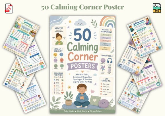
This pack is the workhorse of my regulation corner. Fifty different posters about breathing, naming feelings, taking a break. I printed maybe eight, laminated them, and clipped them to a little ring so a kid can flip to the one that fits. I swap which ones are out every month so it stays fresh.
Fifty is genuinely a lot of value. I’ll be pulling from this set for years without repeating.
My nitpick: with that many, the styling isn’t perfectly uniform across all of them, so a few don’t match the others if you hang them side by side. I just grouped the matching ones together and the mismatch disappeared.
The print file I gifted up the hall instead of hanging
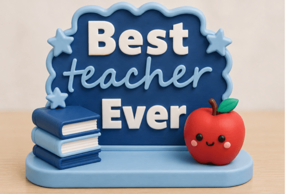
This is a 3D print file, so this one never touched my walls either. Our new teacher down the hall was drowning her first week, the way we all did, so I had the STEM teacher print this little BEST TEACHER EVER piece and I left it on her desk with a note. She nearly cried. The good kind.
It prints small and clean and makes a sweet, cheap gift if you’ve got printer access on campus.
The limitation is the same as every print file here: no printer, no gift. And the fine lettering needs a decent print quality or it comes out rough, so don’t run it on the school printer if it’s been acting up.
Doodle supplies that filled every awkward gap on my board
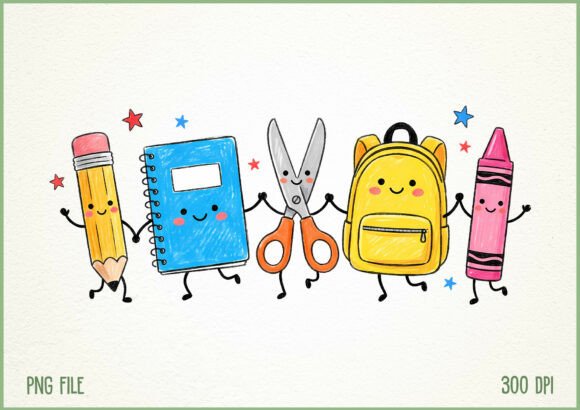
These became my filler heroes. Little hand-drawn pencils, rulers, scissors. Whenever I had a weird empty pocket on a bulletin board, I printed one of these doodles, cut it out, and tucked it in. Suddenly the board looked finished instead of half-planned.
The doodle style is loose and friendly and mixes with almost anything, which is exactly what you want from filler art.
The nitpick: because they’re outline-heavy, they read a little plain on their own. They work as supporting players, not the star. I tried making one the center of a small poster and it looked unfinished. Back to the supporting role it went.
Frequently Asked Questions
what is boho style decor
In a classroom it just means earthy, muted, and a little hand-made looking. Think soft tans, warm rust, sage green, natural textures, and patterns that feel cozy instead of bright and primary. Less fire-engine red, more clay pot.
For me it mostly meant swapping my loud rainbow borders for calmer tones and letting the room breathe. Kids settled a touch. Or I imagined they did. Either way I liked looking at it more.
what is modern boho decor
Modern boho is the same earthy, cozy feel but cleaner and less cluttered. You keep the warm muted colors and natural vibe, then pair it with simple shapes and plenty of empty space instead of cramming every inch.
In practice I picked one calm palette, used a couple of texture pieces, and stopped there. The hardest part of modern boho in a classroom is resisting the urge to add more. I failed at that for years.
what is modern boho interior design
It’s the home-decor version of the same idea: neutral base, warm earthy accents, natural materials like wood and woven texture, and a relaxed, uncluttered layout. Cozy but not busy.
The classroom version borrows the palette and the calm, just on a teacher budget with a copier instead of a furniture store. Same feeling, way less money, a lot more tape.
what is calm classroom
A calm classroom is one set up to keep stress low: softer colors, less visual noise on the walls, a clear quiet corner, and tools kids can use to settle themselves. It’s not about being silent, it’s about not overwhelming them.
Mine isn’t perfect. It’s loud at 1pm no matter what I do. But the muted walls and a real calming corner made a difference I could actually feel by winter.
None of this hangs itself, and half of it will sag by spring no matter how good the file is. That’s just the job. But a handful of these earned their tape, and a couple earned the favors I cashed in to print them.
Start small. Pick one wall, one calm corner, one door sign, and live with it before you redo the whole room. Your future self, standing on a chair at 7am the week before open house, will thank you. Mine never does, but yours might.