The new teacher down the hall asked me last August how I labeled my book bins. I opened my mouth to answer and realized the honest answer was three layers of masking tape and a Sharpie that had gone faint by March.
So this summer I redid the whole reading corner. Bin labels, leveling labels, a few signs taped above the shelves so my second graders stop asking where the dinosaur books live. If you have ever hunted online for one good label in a book example and ended up with forty tabs open and nothing printed, I have been there at 11pm with a cold tea.
Everything below I printed myself, taped up myself, and watched a real class of eight year olds either ignore or actually read. A couple links here are affiliate, which just means the shop tosses me a little if you grab a file. I only kept the ones that survived past October.
A quick note, teacher to teacher: some links below are affiliate links. If you grab a file I may earn a little, at no extra cost to you.
The big shelf sign that anchors the whole corner
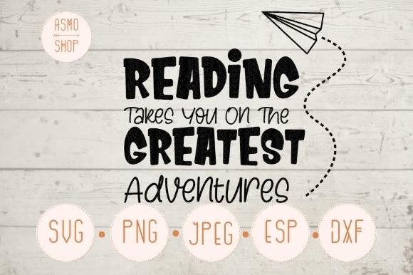
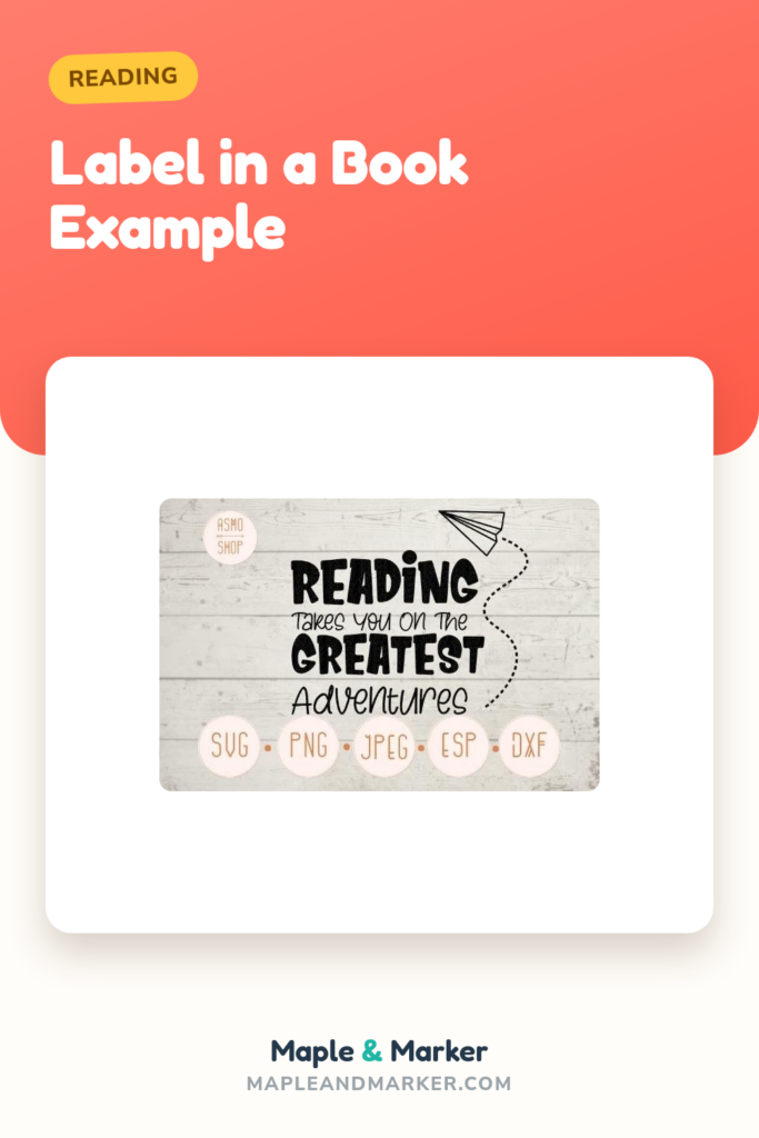
This is the one I taped right above the chapter book shelf, big and centered so it reads from across the room. The line about reading taking you somewhere does the heavy lifting when a kid is standing there deciding if reading is even worth it. I printed it on regular copier paper first to test the size, then on cream cardstock when I knew it fit.
I laminated this one because it lives at kid-height and gets touched. Sticky fingers, a marker that wandered, the usual. The lamination held.
One honest gripe. The art runs wide, so on a standard letter sheet the top and bottom margins get thin. I had to nudge the print scale to about 95 percent to keep the border from kissing the edge. Test print before you commit your good cardstock.
A small sign for the kid who finishes early
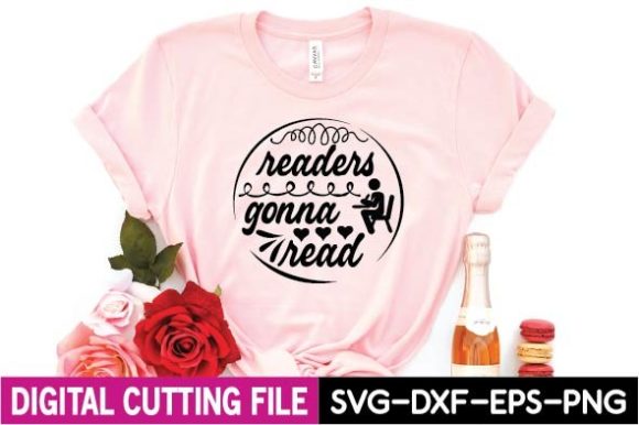
I keep this one taped by the beanbag, the spot where my fast finishers go. Readers gonna read. It is short and a little cheeky and the third graders last year quoted it back at me like it was an inside joke. That is when you know a sign worked.
Printed small, four to a page, so I could cut a stack and stick one on each reading nook. Cardstock, no laminate, because these I swap when they fade.
The nitpick. The lettering is on the thinner side, so at the tiny four-up size it lost a hair of crispness on the workroom copier. Print it bigger or run it on a real printer if you want the lines sharp. At full half-page it looks great.
The label that makes the night owls feel seen
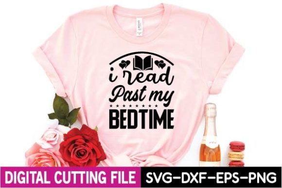
I put this one on the bin of the longer chapter books, the ones a kid takes home and stays up with. I read past my bedtime. Half my class wears that like a badge. A mom told me at conferences her daughter pointed at it and said that’s me, which honestly made my whole week.
I printed it on a label-sized crop and stuck it to the front of a clear bin with packing tape over the top so it wipes clean.
Gripe. It is text-forward with not a ton of art, so on its own it reads a touch plain next to the busier signs. I paired it with a little washi tape border to give it some life. Five minutes, fixed.
The joke sign that started a bookmark debate
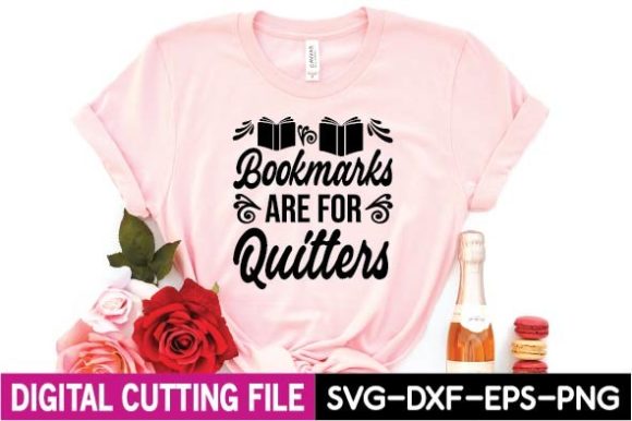
Bookmarks are for quitters. I taped this up as a gag and my room split into two camps for a week, the dog-ear kids versus the bookmark loyalists. Best accidental class discussion I ran all fall. Sometimes a sign is just there to start something.
I printed it half-page on bright yellow cardstock so it pops off the shelf. No laminate, it is in a low-traffic spot above the window seat.
Honest note. The humor skews a little older, so my kindergarten teammate borrowed it and her five year olds did not get it at all. It landed great with my second and third graders. Know your room before you tape it.
A shelf topper for after the movie unit
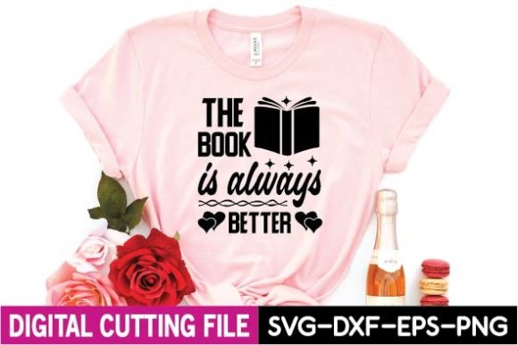
We do a book-versus-movie comparison every spring, so this lives above the shelf where I keep the titles that got made into films. The book is always better. It gives the kids the vocabulary to argue their case, and argue they do.
I printed it on cardstock, taped flat to the shelf face, no lamination. It is up high, away from hands.
The one snag. The design is fairly wide and short, so it does not fill a portrait sheet, it leaves a lot of blank space top and bottom. I trimmed mine down to a banner shape with the paper cutter, which actually looked sharper than the full sheet. Plan to trim.
The bin label for the can’t-put-it-down books
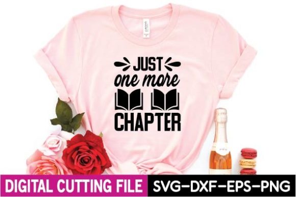
Just one more chapter. This labels the bin of the truly grabby reads, the series everybody fights over. My student teacher last spring laughed when she saw it because she said that was her in college. The kids feel the same energy even if they cannot name it yet.
I cropped it to a label size and slid it into a plastic bin label holder, the clip-on kind, so I can move it when the popular series changes.
Nitpick. The phrase is a little long for a small bin front, so the text shrinks. I bumped the font by printing it on a slightly larger label and it read fine from a step back. At full size, no issue at all.
A quick label for the chapter-book fans
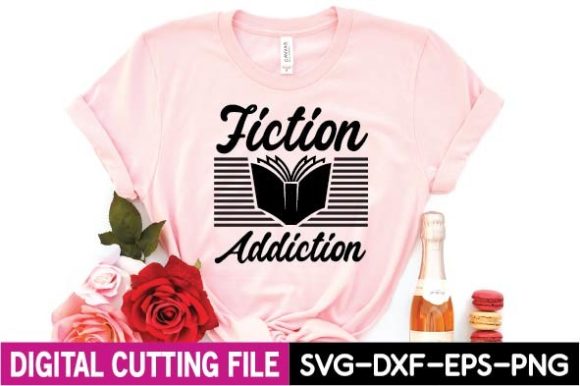
Fiction addiction. Two words, and they do a lot. I stuck this on the fiction shelf divider so the kids who only want made-up stories can beeline straight there during reading time. Cuts down on the where-is-it questions, which during a thirty kid silent reading block is a small miracle.
Printed small, laminated, taped to the metal shelf divider with a loop of tape on the back.
The gripe. Short text on a wide layout means a lot of empty space again. I cropped in tight before printing so it filled the label. If you print it as-is you get a stamp floating in white. Crop first.
The cozy sign for the reading nook corner
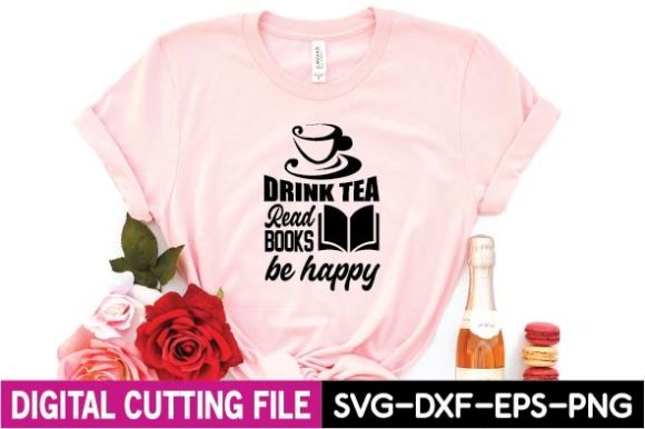
This one is not really for the kids, it is for the mood. Drink tea, read books, be happy. I taped it in the cozy corner with the lamp and the soft rug, the spot a kid earns on a good day. It sets a tone the second they sit down.
I printed it on cream cardstock to match the warm corner and skipped lamination so it stays matte and soft-looking.
Honest note. The tea reference is more grown-up cozy than kid-cozy, so a couple of my second graders asked why there was tea on a reading sign. Fair question. It is decor for the vibe, not a label they read closely, and it does that job well.
A lighthearted sign above the fantasy bin
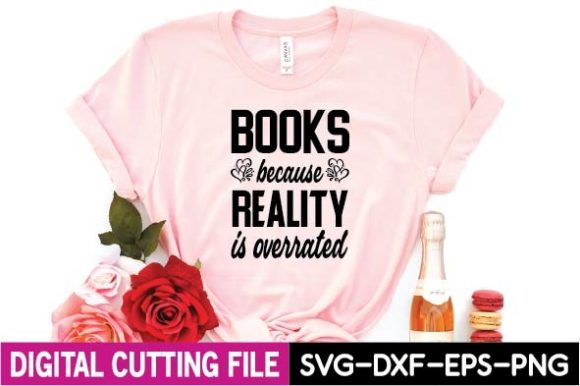
Books because reality is overrated. I put this over the fantasy and dragon-and-magic bin, which is by far my most raided shelf. The line gives the daydreamer kids permission to escape, and those are some of my best readers honestly.
Printed half-page, bright cardstock, laminated because that bin gets manhandled daily.
The nitpick. The wording is a touch sarcastic, and I had one parent at open house raise an eyebrow at reality is overrated like I was teaching the kids to check out. I just explained it was a joke about loving stories and we moved on. Read your community, but mine was fine with it.
The simple label that goes anywhere
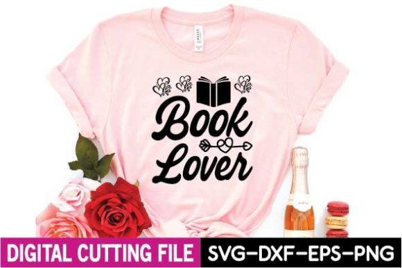
Book lover. Plain, clean, and it fits almost any shelf. This was my catch-all label for the bin that does not have a theme, the mixed pile of well-loved favorites that do not sort neatly. Not every shelf needs a clever line, sometimes you just need words that read fast.
I printed a bunch of these small, four-up, laminated, and used them as backup labels all over the room.
Gripe. Because it is so simple it can read a little flat next to the funnier signs. I let it be the quiet one. Every reading corner needs a couple of those or the whole wall starts shouting at you.
The morning-message sign by the door
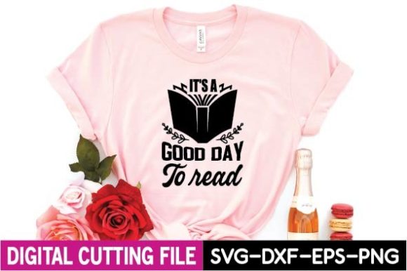
It’s a good day to read. I taped this by the door at kid eye-level so it is the last thing they pass on the way to their seats. Some mornings it is the only calm sentence in the building before the bell, and I mean that for me as much as them.
Printed on cardstock, laminated, because door-level means backpack scuffs and the occasional swinging lunchbox.
The one snag. Mine arrived with the apostrophe in it’s, and if you are printing for a younger room you want that punctuation correct since they copy what they see. It was fine, but I always zoom in on the text before I print a stack. Double check the small stuff.
The shelf sign families notice at open house
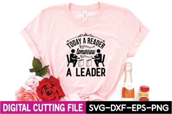
Today a reader, tomorrow a leader. This is the one I hang where the parents stand at open house, right over the main library shelf. It says the quiet part out loud about why we read, and families nod at it every single year.
I printed it large on white cardstock and laminated it since it stays up the whole year. It is my anchor sign and it never comes down.
Nitpick. It is on the earnest side, almost a poster more than a label, so it does not work as a small bin tag. Keep it big. I tried shrinking it once for a shelf edge and it lost all its weight. Print it large or not at all.
A sign for the kid who can’t pick just one
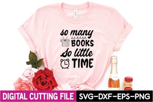
So many books, so little time. I taped this near the checkout bin, the spot where a kid stands frozen holding three books deciding which one to take home. It names exactly that feeling, and a few of mine have read it out loud like a sigh.
Printed half-page on cardstock, no laminate, easy to swap.
The gripe. It is a longer phrase, so at small sizes the text crowds. I gave it a full half-sheet of its own and let it breathe. Crammed into a tiny label it just looks busy. Give this one room.
The warm sign for the February reading display
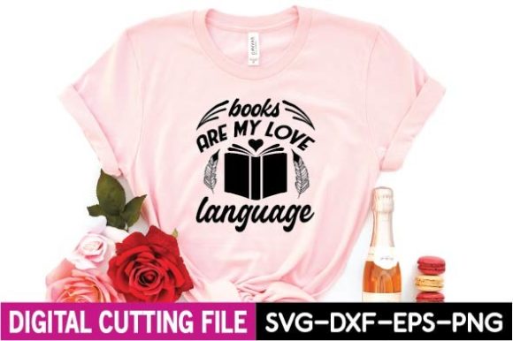
Books are my love language. I pull this one out in February for the reading-themed bulletin board, then it migrates to the cozy shelf for the rest of the year because I cannot bear to take it down. It is sweet without being mushy, and the kids who really love reading light up at it.
Printed on soft pink cardstock for the February board, laminated so it survives the move to the shelf later.
Honest note. The love-language phrasing is a bit of a grown-up trend line, so my younger ones did not catch the reference. Did not matter. It reads as warm and book-ish even if you do not know the saying, and that was enough for my room.
Frequently Asked Questions
what is a reading log
A reading log is just a simple sheet where a kid tracks what they read and for how long, usually a few minutes a night with a parent initial or a quick title scribble. I keep mine dead simple, a date, a title, and a smiley or frowny for how it went.
The trick is to not make it homework-feeling. I tape a fresh one inside the front of each book bin folder and keep my expectations low. A log that gets filled out badly beats a fancy one that gets ignored.
what are you reading bulletin board
A what are you reading board is a wall where kids post the title they are currently reading, usually on a little card or a sticky with their name. It turns reading into something social, which is half the battle with a reluctant class.
I run mine with library pocket cards and let kids move their name when they finish a book. The signs in this post double as the header art for that board, so you can build the whole display from the same set and keep it looking like it belongs together.
None of this has to happen in one weekend. I rebuilt my reading corner one prep period at a time, printed a few signs, taped them up crooked, fixed them the next morning with my coffee. The kids did not notice the crooked. They noticed the dragon bin finally had a label.
Start with the two or three signs that make you smile, print them flat, laminate the ones that live at kid-height, and let the rest wait. Your reading corner does not need to look like a magazine. It needs to make an eight year old want to grab a book and disappear into the beanbag. Mine finally does, mostly. We do what we can.